Topics
A maintenance manager pulls the ten machines with the most failures last month and sends a technician to each. Next month they fail less. A contact centre picks its lowest-scoring agents for coaching, and their scores rise. A hospital targets the wards with the worst readmission rates, and the rates fall. In each case the intervention gets the credit, and in each case a large part of the improvement was going to happen anyway.
Why Extremes Move Back
Every observed number is a stable part plus noise, $Y = T + \varepsilon$. Selecting units because $Y$ was extreme selects partly on $T$ and partly on $\varepsilon$. The noise does not persist: the next measurement draws fresh noise with mean zero, so the selected group's expected next value sits closer to the population mean than the value it was selected on.
The size of the move is not mysterious. If consecutive measurements have correlation $\rho$ and the population mean is $\mu$, then
A group selected at level $y$ is expected to move back by $(1-\rho)(y-\mu)$ with nothing done to it. At $\rho = 0.5$, half of the excess disappears on its own. That correlation is the reliability of a single measurement, and for counts over short windows it is often lower than people assume.
1
2
3
4
5
6
7
8
9
10
11
12
13
14
15
16
17
18
19
20
21
22
23
24
25
import numpy as np

rng = np.random.default_rng(42)
n_units = 500

# each machine has a stable underlying monthly failure rate
true_rate = rng.gamma(shape=4.0, scale=1.0, size=n_units)   # mean 4, sd 2

# two consecutive months; nothing changes between them
m1 = rng.poisson(true_rate)
m2 = rng.poisson(true_rate)

k = n_units // 10
worst = np.argsort(m1)[-k:]     # the 10% with the most failures in month 1
best = np.argsort(m1)[:k]

print(f"fleet mean:  {m1.mean():.2f} -> {m2.mean():.2f}")
print(f"worst 10%:   {m1[worst].mean():.2f} -> {m2[worst].mean():.2f}")
print(f"best 10%:    {m1[best].mean():.2f} -> {m2[best].mean():.2f}")
print(f"true rate of the worst group = {true_rate[worst].mean():.2f}")

rho = np.corrcoef(m1, m2)[0, 1]
mu = m1.mean()
print(f"rho = {rho:.2f}, predicted month 2 for worst group = "
      f"{mu + rho * (m1[worst].mean() - mu):.2f}")
The fleet as a whole does not move: 3.95 failures per machine in month one, 4.00 in month two. The worst decile goes from 9.44 to 7.02, a 26 percent drop, with no technician sent anywhere. The correlation between months is 0.54, and the formula predicts 6.92 for the worst group's second month. The observed 7.02 is within noise of that, and both are almost exactly the group's true rate of 7.00. The excess over 7 in month one was entirely bad luck, and the luck ran out on schedule.
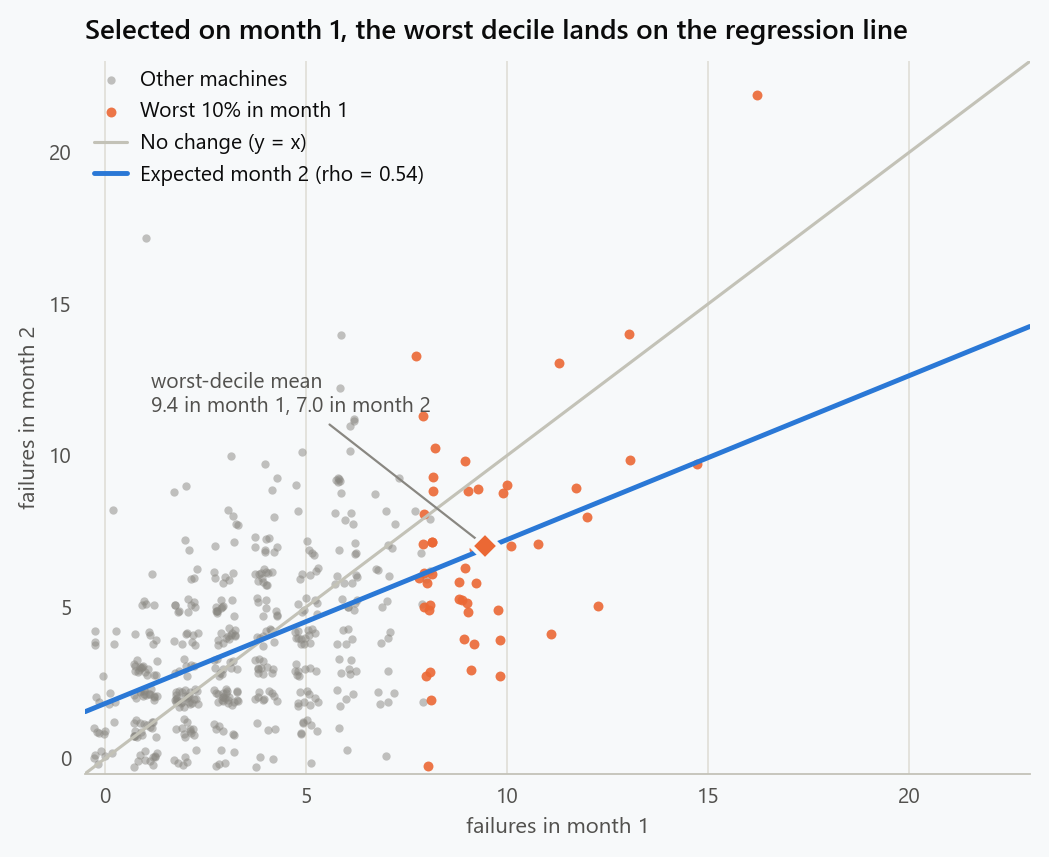
The picture makes the mechanism visible. The identity line is where machines would sit if month two repeated month one. The selected machines sit almost entirely below it, not because anything happened to them, but because they were chosen from the upper tail of a noisy measurement and the regression line, not the identity line, is where their expected values lie.
The Mirror Image
The best decile went the other way, from 0.52 failures to 2.22, about a fourfold increase. Nobody opens an investigation into why the best machines deteriorated, which is precisely why the effect goes unnoticed: attention is asymmetric, the statistics are not. Any before-after analysis of a selected group should report what happened to the opposite extreme over the same period. If the best group got worse by about as much as the worst group improved, the intervention has not yet demonstrated anything.
A Placebo Test
The cleanest exposure is to intervene on only part of the selected group, chosen at random, and do nothing to the rest.
1
2
3
4
5
rng2 = np.random.default_rng(1)
treated = rng2.choice(worst, size=k // 2, replace=False)
control = np.setdiff1d(worst, treated)
print(f"treated: {m1[treated].mean():.2f} -> {m2[treated].mean():.2f}")
print(f"control: {m1[control].mean():.2f} -> {m2[control].mean():.2f}")
The treated half improves from 9.84 to 7.16. The untreated half improves from 9.04 to 6.88. The treatment here is nothing at all, and it performs exactly as well as nothing at all. A real intervention has to beat the control half, not the baseline.
Where a held-out control is impossible, history offers a substitute. Take last year's worst decile, selected the same way, and look at what happened to it the following month before any programme existed. That number is the regression effect measured on your own data, and it is the bar an intervention has to clear.
Longer Baselines Help, Less Than Expected
Selecting on a single month selects on a lot of noise. Averaging more months before selecting reduces the noise, so the selected group's baseline sits closer to its true rate. Averaged over 200 replications of the same fleet:
| Baseline | Selected baseline | True rate of group | Next month | Apparent drop | $\rho$ |
|---|---|---|---|---|---|
| 1 month | 9.91 | 6.93 | 6.95 | 30% | 0.50 |
| 3 months | 8.80 | 7.59 | 7.59 | 14% | 0.61 |
| 6 months | 8.49 | 7.85 | 7.85 | 7% | 0.65 |
| 12 months | 8.32 | 7.98 | 8.03 | 3% | 0.68 |
Two things are visible. The apparent drop shrinks, but it does not vanish even with a year of data. And the group's true rate rises: with more data the selection finds the machines that are genuinely bad rather than the ones that had a bad month. In the one-month selection only half of the "worst 50" were actually among the 50 worst machines by true rate.
There is a trade-off hiding here. Real failure rates are not stable for twelve months. Machines age, loads change, seasons turn. A long baseline reduces selection noise but reports a machine as it was, not as it is. Three to six months is usually the sensible region, and the residual regression effect still has to be subtracted.
Measuring an Intervention That Works
The placebo test shows what to do when a control group inside the selected units is possible. Often it is not: the programme goes to every machine in the worst decile, and the only comparison available is the rest of the fleet. That comparison has to be made carefully, because the rest of the fleet was also selected, in the opposite direction.
Rerun the fleet with a real effect. The worst decile receives an intervention that removes 1.5 failures per month.
1
2
3
4
5
6
7
8
9
10
11
12
13
14
15
16
17
rng = np.random.default_rng(42)
true_rate = rng.gamma(shape=4.0, scale=1.0, size=n_units)
m1 = rng.poisson(true_rate)
worst = np.argsort(m1)[-k:]
treated = np.zeros(n_units, dtype=bool)
treated[worst] = True

effect = -1.5
m2 = rng.poisson(np.clip(true_rate + effect * treated, 0.05, None))

naive = m2[treated].mean() - m1[treated].mean()
did = naive - (m2[~treated].mean() - m1[~treated].mean())
X = np.column_stack([np.ones(n_units), m1, treated.astype(float)])
ancova = np.linalg.lstsq(X, m2, rcond=None)[0][2]
print(f"naive before-after         = {naive:+.2f}")
print(f"difference-in-differences  = {did:+.2f}")
print(f"baseline-adjusted estimate = {ancova:+.2f}")
The true effect is -1.50. The naive before-after change on the treated machines is -4.10: the real effect and the regression effect, added together and presented as one number. Difference-in-differences against the rest of the fleet gives -4.40, which is worse. The comparison group was selected too, as the machines that were not extreme in month one, so its month-two average drifts slightly upward, and subtracting that drift adds to the bias instead of removing it. Over 500 replications the averages are -4.50 for the naive estimate, -4.83 for difference-in-differences, and -1.54 for the third estimate.
That third estimate regresses month two on month one and a treatment indicator. It is the analysis of covariance, and it works here for a specific reason: the selection was made on month one, so once month one is held fixed, being treated carries no further information about luck. Conditioning on the selection variable removes the selection effect. The change-score methods fail because they treat the baseline as a fixed characteristic of the unit rather than as the noisy measurement the selection was based on.
This is Lord's paradox in operational clothing. When groups were formed on the basis of a baseline measurement, adjust for the baseline in a regression. Do not compare changes.
Unequal Histories
Real fleets do not have the same amount of history for every unit. New machines have a month of data, old ones have years. Ranking on raw rates treats a bad month on a new machine the same as a bad year on an old one, and the new machine, having the noisier estimate, is the one more likely to appear at the top of the list.
The gamma-Poisson model handles this directly. With a gamma prior on the rate, the posterior mean after observing $y_i$ failures over $t_i$ months is
which puts weight $t_i / (\beta + t_i)$ on the unit's own data and the rest on the fleet prior. Units with long histories keep their own estimate. Units with short histories are pulled toward the mean, and the amount of pull is set by the data rather than by a rule of thumb.
1
2
3
4
5
6
7
8
9
10
11
12
13
14
15
16
17
18
rng = np.random.default_rng(3)
true_rate = rng.gamma(4.0, 1.0, n_units)
months = rng.choice([1, 3, 12], size=n_units, p=[0.4, 0.4, 0.2])   # history per machine
totals = np.array([rng.poisson(tr, m).sum() for tr, m in zip(true_rate, months)])
raw = totals / months

# method-of-moments gamma prior for the fleet
mean = raw.mean()
var = max(raw.var() - (raw / months).mean(), 1e-6)
beta_prior = mean / var
alpha_prior = mean * beta_prior
shrunk = (alpha_prior + totals) / (beta_prior + months)

nxt = rng.poisson(true_rate)
for name, score in (("raw rate", raw), ("shrunk", shrunk)):
    sel = np.argsort(score)[-k:]
    print(f"{name:<9} share with 1 month of history = {np.mean(months[sel] == 1):.0%}, "
          f"score {score[sel].mean():.2f}, next month {nxt[sel].mean():.2f}")
Ranking on raw rates fills 42 percent of the worst decile with machines that have a single month of history. Ranking on shrunk rates brings that down to 26 percent. The prior puts 47 percent weight on a one-month machine's own data and 92 percent on a twelve-month machine's. The selected group's score is also honest about what comes next: the raw ranking promises 8.99 failures per machine and delivers 7.66, while the shrunk ranking promises 7.37 and delivers 7.72.
A ranking that keeps its promises is worth more than it looks. It is what allows the technician's expected saving per visit to be computed before the visit, and it is what makes the before-after number for the programme interpretable, because the baseline it starts from is no longer inflated.
The Winner's Curse Is the Same Effect
Selecting the best of several options is selecting on an extreme, and the selected estimate is biased upward for the same reason the worst machines were biased downward.
1
2
3
4
5
6
7
8
9
10
11
rng = np.random.default_rng(11)
K, n, p_true = 10, 2000, 0.05
lift_test, lift_again = [], []
for _ in range(2000):
    test = rng.binomial(n, p_true, K) / n          # ten identical variants
    winner = test.argmax()
    again = rng.binomial(n, p_true) / n            # the winner, measured afresh
    lift_test.append(test[winner] - p_true)
    lift_again.append(again - p_true)
print(f"winner's lift in the test  = {np.mean(lift_test) * 100:+.2f} points")
print(f"winner measured again      = {np.mean(lift_again) * 100:+.2f} points")
Ten variants, all identical, each measured on 2,000 users. The winner's conversion rate in the test sits 0.76 percentage points above the truth, a relative lift of about 15 percent, and when the same variant is measured again it delivers nothing. The team ships the winner, the lift fails to materialise, and someone is asked to explain what changed. Nothing changed. The selection was on noise, and here the regression effect is the whole story.
The same arithmetic explains why the best model on a validation set does worse in production than its validation score, and why the forecasting method that won on last year's data is a little less likely to win next year than its margin suggests. The estimate for anything chosen because it looked best is optimistic by an amount that grows with the number of candidates and shrinks with the sample size, and the only honest estimate comes from data the choice was not made on.
Where It Shows Up
Road safety is the canonical case. Speed cameras placed at sites with recent accident spikes showed large reductions in accidents, and a substantial share of those reductions was regression to the mean; empirical Bayes before-after methods became standard in the field largely because of it. Clinical follow-ups show the same pattern when patients are enrolled on the strength of one high blood pressure reading, and it is one reason trials measure a run-in period before randomising. In machine learning operations it appears as the worst slice that improves after a retraining that did not touch it, the alert threshold tuned on last month's worst week, and the hyperparameter configuration that topped a leaderboard and then disappointed. Kahneman's flight instructors, who concluded that criticism works and praise backfires because performance after a bad landing improved and performance after a good one deteriorated, had the same data and the same wrong explanation.
What to Do
Before crediting any intervention aimed at extreme performers:
- Estimate $\rho$ from consecutive periods of your own historical data. If it is 0.5, expect half the excess to vanish unaided.
- Compute the expected regression with the formula and treat it as the null. An intervention has to beat that, not zero.
- Hold out a random part of the targeted group, or use a historical pre-programme cohort selected the same way, as a control.
- If the only comparison group was selected differently, regress the outcome on the baseline and a treatment indicator. Do not compare change scores, with or without a comparison group.
- Select on shrunk estimates over a baseline of several periods, with unit-specific shrinkage when histories differ in length.
- Report the mirror: what happened to the best decile over the same window.
- Discount anything chosen because it looked best, in proportion to how many alternatives it beat and how little data it was chosen on.
None of this says targeted interventions do not work. It says that the evidence usually offered for them is compatible with their not working at all, and that the fix is a matter of design rather than of more data.
The figure generator in the blog-reproducibility repository reproduces this article's figure; run it with --dry-run to print the numbers behind the figure without writing an image.
References
- Galton, F. (1886). Regression towards mediocrity in hereditary stature. Journal of the Anthropological Institute of Great Britain and Ireland, 15, 246-263.
- Barnett, A. G., van der Pols, J. C., & Dobson, A. J. (2005). Regression to the mean: what it is and how to deal with it. International Journal of Epidemiology, 34(1), 215-220.
- Lord, F. M. (1967). A paradox in the interpretation of group comparisons. Psychological Bulletin, 68(5), 304-305.
- Efron, B., & Morris, C. (1977). Stein's paradox in statistics. Scientific American, 236(5), 119-127.
- Hauer, E. (1997). Observational Before-After Studies in Road Safety. Pergamon.
- Kahneman, D. (2011). Thinking, Fast and Slow. Farrar, Straus and Giroux.
Embed interactive plots, widgets, and demos using <figure>, <iframe>, or <div class="interactive-embed"> containers. Ensure each embed includes descriptive captions for accessibility.
How to cite
Use the quick export buttons to save citations for reference managers or copy the formatted text directly.
Diogo Ribeiro (2025). Regression to the Mean: The Improvement You Did Not Cause. Faculty of Media Arts and Design, Technical University of Porto. https://diogoribeiro7.github.io/statistics/regression_to_the_mean_operational_analytics/.