Topics
A freezing morning is compatible with a warming climate. Warming changes the conditions from which weather develops; it does not require every day, in every place, to be warm.
That distinction matters when a photograph of snow is offered as a rebuttal to climate change. The photograph may document real weather. The mistake is the extra claim that this observation could not happen in a warmer climate.
NOAA describes weather in terms of atmospheric conditions at a particular time and place, while climate concerns patterns over longer periods. Its discussion of snowstorms and global warming makes clear why the two can coexist. NOAA explanation.
We can examine the logic with a small calculation. It will not tell us how much a real place has warmed. It will show why the existence of cold days cannot, by itself, rule out warming.
Move the distribution, keep the variation
Imagine temperatures measured at the same time of day during comparable winter periods in a hypothetical location.
In the first climate, the mean temperature is 5°C. In the second, it is 7°C. In both, temperatures follow a bell-shaped normal distribution with a standard deviation of 5°C. That last number controls how widely daily temperatures vary around the mean.
These values are invented. The two-degree shift is a modelling choice, not an estimate for the world or any particular city.
The second distribution is warmer, but it still extends below freezing. Shifting its centre has not removed its lower tail.
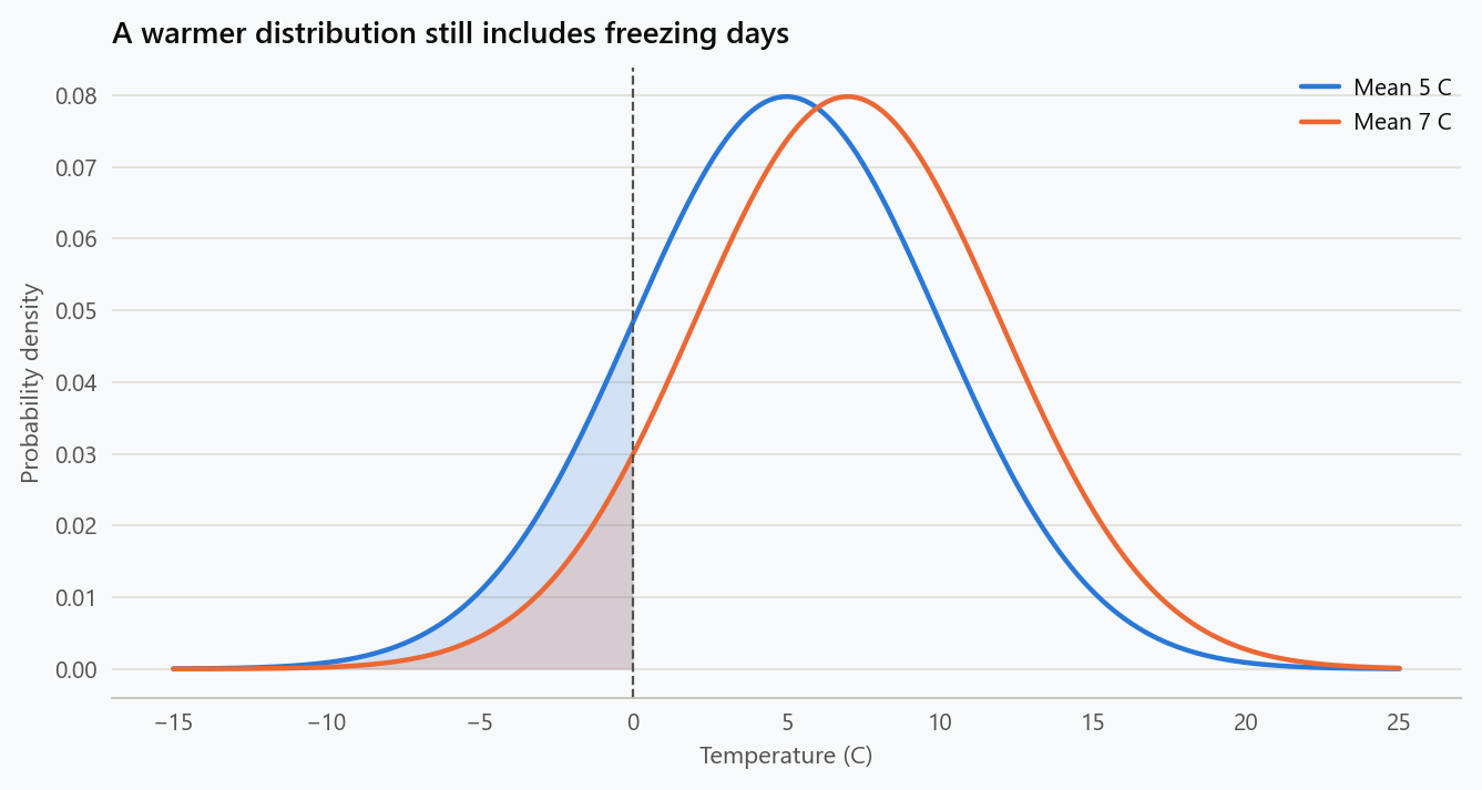
Original illustration. Both distributions have a standard deviation of 5°C. Shading marks temperatures below freezing; the curves are hypothetical, not fitted climate records.
The probabilities make the picture precise:
| Event in the hypothetical winter | Mean 5°C | Mean 7°C |
|---|---|---|
| Temperature below 0°C | 15.9% | 8.1% |
| Temperature above 15°C | 2.3% | 5.5% |
Freezing days become less common without becoming impossible. Relatively warm winter days become more common.
Among 1,000 comparable observations, the expected number below freezing falls from about 159 to 81. Those are expected counts, not promises about the next 1,000 days. Actual counts fluctuate, and cold days can occur in clusters.
One freezing day is therefore entirely unsurprising under the warmer model. The useful comparison concerns how often such days occur across comparable observations.
A change in the average does not add two degrees to every day
There is a tempting interpretation of the example: take every day in the first climate, add two degrees, and that is precisely what the corresponding day in the second climate must be like.
The distributions do not establish such a pairing. They describe possible values and their frequencies. A particular day in a warmer climate can be colder than a particular day in a cooler climate.
For the same reason, an increase in average human height would not imply that every person born later must be taller than every person born earlier. A change in a population pattern allows considerable overlap between individual observations.
The analogy is about distributions, not an assertion that temperature and height have the same causes. It helps identify the logical step that fails: replacing a claim about a changing pattern with a claim about every individual instance.
Does one cold day tell us nothing?
It tells us something about the weather at that place and time. It may also contribute to a larger analysis when recorded consistently alongside other observations.
Even in our simple model, a freezing day is more probable under the cooler distribution than under the warmer one. If those were the only two candidate models and the observation had been selected in advance, the event would favour the cooler candidate. It would not make the warmer candidate impossible.
An online photograph is usually a different kind of evidence. Someone may have selected a striking event after looking across many locations and dates. To interpret it, we would need to account for that selection, including all the ordinary days that were available to choose from.
This is why the correction should not be “ignore all cold weather.” A consistent record includes both cold and warm observations. The problem is treating one selected observation as though it were the entire record.
Give one observation a weight of evidence
The overlap between the curves is a good starting point for a deeper question: if both climates allow cold weather, how can observations help us distinguish them?
Call the warmer distribution $P=\mathcal N(7,5^2)$ and the cooler distribution $Q=\mathcal N(5,5^2)$. Their probability densities are $p(x)$ and $q(x)$. We are comparing these two fully specified models, not all possible explanations of Earth's climate.
Suppose a measurement selected in advance is 0°C. For a continuous distribution, the probability of exactly one infinitely precise value is zero. The height of a density is not a probability. We can nevertheless compare the two densities at that measurement: the ratio also approximates the ratio of probabilities for the same sufficiently narrow measurement interval around it.
The likelihood ratio is
A value above one favours the warmer candidate; a value below one favours the cooler candidate. The ratio compares how well the models predict the observation. It does not directly give the probability that either model is true.
For our equal-variance normal distributions, the normalising factors cancel. Taking natural logarithms gives a particularly simple expression:
The logarithm turns multiplication into addition, which will matter when we examine a record containing many observations.
| Temperature observed | Log likelihood ratio $\ell(x)$ | Likelihood ratio $p(x)/q(x)$ |
|---|---|---|
| 0°C | −0.48 | 0.619 |
| 6°C | 0.00 | 1.000 |
| 10°C | 0.32 | 1.377 |
| 15°C | 0.72 | 2.054 |
A 0°C measurement favours the cooler model by about $1/0.619=1.62$ to one. That is evidence in a direction, not a logical contradiction of the warmer model. A 15°C observation pushes in the other direction, by about 2.05 to one.
The models agree at 6°C, halfway between their means. In this particular comparison, every temperature below 6°C contributes negative log evidence for $P$, and every temperature above it contributes positive log evidence. Freezing has physical significance, but the likelihood comparison has no special discontinuity at 0°C.
To turn a likelihood ratio into posterior odds, we would also need prior odds. With equal prior odds and only these two candidates, the 0°C observation would give the warmer model a posterior probability of $0.619/(1+0.619)$, about 38.2%. Changing the priors changes that probability. Neither this artificial prior nor these two candidates represent the full evidence used in climate science.
KL divergence is the average of those evidence contributions
Now imagine that the warmer distribution $P$ generates the observations. Sometimes it produces a freezing day, whose log likelihood ratio favours $Q$. More often, across a sufficiently representative record, it produces observations that collectively favour $P$.
The average log likelihood ratio under $P$ is the Kullback–Leibler divergence from $P$ to $Q$:
Read the expression in order: draw temperatures from $P$, score each temperature by its log evidence for $P$ over $Q$, and average those scores. Individual scores can be negative even though their expectation is nonnegative.
For our example, we do not need to evaluate an integral numerically. Since $\ell(x)=0.08(x-6)$ and the mean under $P$ is 7°C,
Using natural logarithms expresses the answer in nats per observation. Dividing by $\log 2$ gives about 0.115 bits per observation. These are information units: 0.08 nats is not an 8% probability, an 8% temperature increase, or an 8% confidence level.
Another interpretation uses predictive scoring. The negative log density, $-\log q(x)$, penalises a model for giving low density to the realised value. When the data come from $P$, predicting with $Q$ incurs an average additional log-score loss of 0.08 nats compared with predicting with $P$. The score difference uses the density ratio, so a consistent change from Celsius to Fahrenheit leaves this KL divergence unchanged.
This is the connection between the snow photograph and information theory. One observation can favour the cooler model while the warmer distribution still predicts the complete collection better on average. The MIT information-theory notes by Polyanskiy and Wu, Chapters 1–3, develop divergence, likelihood comparisons, and the effect of processing observations.
A temperature record accumulates evidence, with fluctuations
Under an additional independence assumption, the likelihood of a record is the product of its individual likelihoods. Its log likelihood ratio is therefore
For these two fixed normal candidates, the sample mean contains everything needed for this comparison. This sufficiency is specific to the model: a mean would not generally capture differences in variability, extremes, or temporal dependence.
Consider the invented ten-observation record
Its mean is 7°C. The freezing observation contributes $-0.72$ nats, but the complete record contributes $L_{10}=0.8$ nats. The total likelihood ratio is $e^{0.8}\approx2.23$ in favour of the warmer candidate. Removing the −3°C observation because it is inconvenient would misrepresent the record just as selecting only that observation would.
We can also calculate how much $L_n$ varies between hypothetical records. Under $P$, a single contribution has mean 0.08 and standard deviation $0.08\times5=0.4$. For independent observations,
where the second parameter is the variance. Under $Q$, the mean is $-0.08n$ and the variance is the same.
| Independent observations | Expected $L_n$ under $P$ | Standard deviation | Probability that $L_n<0$ under $P$ |
|---|---|---|---|
| 1 | 0.08 | 0.40 | 42.1% |
| 10 | 0.80 | 1.26 | 26.4% |
| 25 | 2.00 | 2.00 | 15.9% |
| 100 | 8.00 | 4.00 | 2.3% |
Even when $P$ generates the data, a short record can favour $Q$. More independent observations increase the expected separation faster than its standard deviation grows. None of these probabilities is a statement about the chance that real global warming exists; they describe errors in choosing between our two invented candidates using the sign of $L_n$.
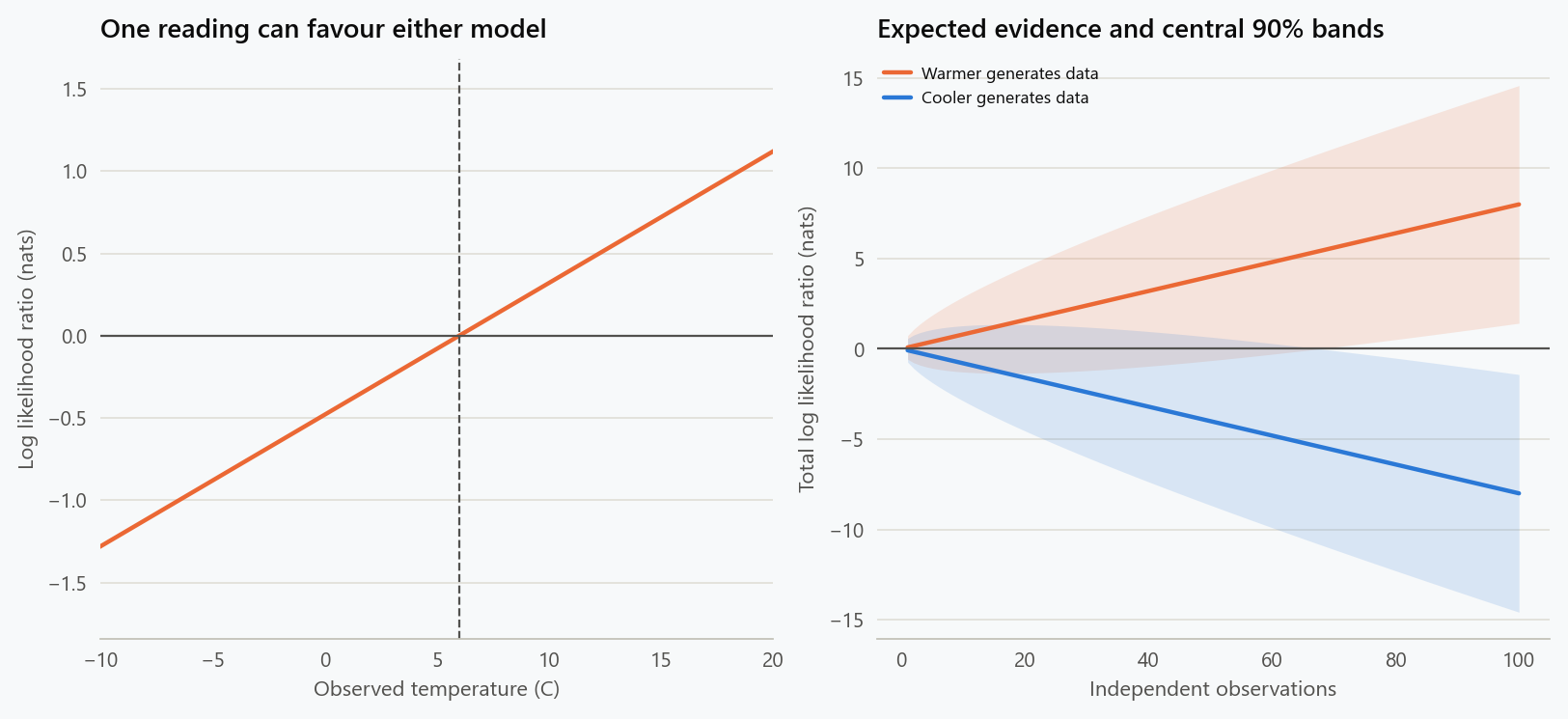
Exact model calculation. Shaded bands describe variation between independent records at each fixed sample size. They are not confidence intervals for a climate trend, simultaneous bands, or a simulation of actual daily weather.
What is lost when we keep only “freezing” or “not freezing”?
The original claim discarded most of the thermometer reading. It retained only the answer to a yes-or-no question: was the temperature below zero?
Under $P$, that answer is yes with probability $a=0.080757$. Under $Q$, it is yes with probability $b=0.158655$. A freezing observation therefore has likelihood ratio $a/b\approx0.509$. A nonfreezing observation has ratio $(1-a)/(1-b)\approx1.093$.
The divergence between those binary observations is
That is only about 34% of the 0.08 nats available from the full temperature measurement in this model. The threshold treats −12°C and −1°C alike, and treats 1°C and 18°C alike, although their evidence contributions differ substantially.
This is an example of the data-processing inequality: applying the same processing rule to observations from either candidate cannot increase their KL divergence. A threshold can be useful for a specific question, but it can also discard information relevant to another question. It does not manufacture additional evidence about which distribution generated the measurement.
Selection creates a different complication. Suppose someone searches 100 independent observations and reports whether at least one was freezing. Even under the warmer model, that probability is
The cooler model also makes the event overwhelmingly likely. Finding a single cold example somewhere in a large search is therefore a weak discriminator between these candidates. The observation process is “search many, display one,” not “record one prespecified day.” Real locations and adjacent days are correlated, so the number 100 cannot simply be transferred to a collection of weather photographs.
Why the order in KL divergence matters
The notation $D_{\mathrm{KL}}(P|Q)$ tells us which distribution supplies the observations and which is used as the alternative. Swapping them generally changes the answer.
For normal distributions with means $\mu_P,\mu_Q$ and positive standard deviations $\sigma_P,\sigma_Q$, substitution into the density ratio gives
Our original equal-variance example happens to give 0.08 nats in both directions. That symmetry comes from its special assumptions. If the cooler candidate retains mean 5°C and standard deviation 5°C, while the warmer candidate has mean 7°C and standard deviation 7°C, the divergences become about 0.224 nats from warmer to cooler and 0.132 in the reverse direction.
The distributions now differ in spread as well as location. Their tails receive different weights depending on which candidate generates the observations. KL divergence is consequently not a geometric distance with all the usual distance properties: in general it is asymmetric and does not obey the triangle inequality.
Nor is it a direct measure of damage. A distributional change can matter greatly for a particular crop, ecosystem, or threshold without its consequences being summarised by one information-theoretic number. KL answers a question about statistical distinguishability, not the complete question about impacts.
Real climate records require a richer comparison
The independence assumption made the arithmetic transparent. It also made every observation a fresh contribution with the same distribution. A sequence of adjacent winter days does not automatically have that property: a persistent weather system can produce several related measurements.
With dependence, the joint likelihood must account for conditional distributions. Summing marginal log density ratios as though each day were independent can overstate the evidence. Repeating the same measurement 100 times supplies no new physical information, even though an incorrectly multiplied likelihood would become extremely confident.
Our means and standard deviations were also specified before observing the record. If we estimate them from the same observations we score, the fitted model receives an advantage from having adapted to those observations. A real comparison must address parameter uncertainty and the fitting procedure, for example through an appropriate predictive evaluation or a likelihood analysis that includes estimation.
Finally, a better fit between these two hypothetical distributions would not identify the physical cause of an actual shift. Detecting change, attributing its causes, and estimating consequences are related but distinct investigations. The KL calculation explains why consistent records can distinguish overlapping patterns; it does not replace climate observations, physical modelling, or attribution studies.
Match the place and the time window
Another mismatch occurs when a claim about the global climate is answered with a measurement from one town. A local temperature is part of the information needed to describe the world, but it does not represent every other place.
The time window matters too. Comparing a July afternoon with a January morning tells us little about whether the same location's winters are changing. A useful comparison would keep the season, measurement definition, and observation time comparable.
NOAA's conventional US climate normals summarise 30-year periods. For example, a January temperature normal averages comparable January observations across the reference years. Those reference periods provide context for an unusual day or month. They are not a rule that makes every shorter observation worthless. NOAA Climate Normals.
Before using a weather example to support a climate claim, establish what is being compared: one location or a geographic average, one afternoon or a seasonal pattern, and a consistent instrument record or a collection of memorable anecdotes.
What the illustration leaves out
Real temperature distributions need not be perfect bell curves. Their spread and shape can change, and neighbouring days are not generally independent. Our example also omits precipitation, circulation, geography, and the physical causes of warming.
Those omissions limit what the numbers can establish. An 8.1% freezing probability is not a forecast. Nor does the example determine how warming affected a particular snowstorm.
Its contribution is a counterexample to a specific claim. If someone says that warming makes freezing days impossible, a coherent warmer distribution containing freezing days shows why that inference fails. Estimating the real change requires observations and an appropriate physical and statistical analysis.
The same discipline applies to warm weather. One unusually hot afternoon does not, by itself, quantify a long-term trend or explain its cause. The evidential standard should not change with the direction of the anomaly.
A correction that keeps the evidence in view
A useful reply to a snow photograph might be:
Cold weather can still occur in a warmer climate. The question is whether comparable cold events become more or less frequent over time, alongside changes in the rest of the temperature record.
That reply leaves room for the observation while correcting the conclusion. It also tells the reader what evidence would help: a defined location or region, a consistent time window, and a record that includes the unremarkable days as well as the dramatic ones.
Reproduce the example
Python's standard library calculates the probabilities directly:
1
2
3
4
5
6
7
from statistics import NormalDist

for mean in (5, 7):
    temperature = NormalDist(mean, 5)
    freezing = temperature.cdf(0)
    warm = 1 - temperature.cdf(15)
    print(f"Mean {mean} C: below zero {freezing:.1%}; above 15 C {warm:.1%}")
The information calculations also use only the standard library:
1
2
3
4
5
6
7
8
9
10
11
12
13
from math import exp, log, sqrt
from statistics import NormalDist

warmer, cooler = NormalDist(7, 5), NormalDist(5, 5)
a, b = warmer.cdf(0), cooler.cdf(0)
binary_kl = a * log(a / b) + (1 - a) * log((1 - a) / (1 - b))
full_kl = (7 - 5)**2 / (2 * 5**2)
print(f"Full measurement: {full_kl:.5f} nats; freezing indicator: {binary_kl:.5f}")
for n in (1, 10, 25, 100):
    evidence = NormalDist(n * full_kl, 0.4 * sqrt(n))
    print(n, f"P(log evidence < 0 | warmer) = {evidence.cdf(0):.1%}")
record = [-3, 1, 4, 6, 8, 9, 10, 11, 12, 12]
print(f"Record likelihood ratio: {exp(sum(0.08 * (x - 6) for x in record)):.3f}")
The shared figure generator reproduces both figures and the numerical comparisons. Its --dry-run option prints the calculations without writing images. Independent checks integrate the normal-density log ratio and verify the loss of information after thresholding.
Archive note: dated 15 February 2024 for this collection; written and source-checked on 18 September 2026.
Embed interactive plots, widgets, and demos using <figure>, <iframe>, or <div class="interactive-embed"> containers. Ensure each embed includes descriptive captions for accessibility.
How to cite
Use the quick export buttons to save citations for reference managers or copy the formatted text directly.
Diogo Ribeiro (2024). Cold Days Still Belong in a Warming Climate. Faculty of Media Arts and Design, Technical University of Porto. https://diogoribeiro7.github.io/science-communication/cold_days_in_a_warming_climate/.