Topics
The average order value dropped two percent on a Tuesday and stayed there. Three teams spent a day on it: pricing checked for a promotion, product checked for a release, and the analyst rebuilt the query twice. Nothing about customers had changed. An enrichment service had started failing on one segment, those rows now arrive with the value field empty, and the average is computed over the rows that survive.
This is the most common way a metric moves, and the monitor watching the metric is the worst instrument for finding it. The information needed to diagnose it in minutes sits one step upstream, in the share of rows that arrive complete.
A Pipeline That Fails Unevenly
The simulation generates a day of events in three segments whose values differ, and an enrichment failure that nulls rows at a rate more than three times higher in the most valuable segment. That asymmetry is what makes the failure show up in the metric at all.
1
2
3
4
5
6
7
8
9
10
11
12
13
14
15
16
17
18
19
20
21
22
23
24
25
26
27
28
29
30
31
32
33
34
import numpy as np

RNG = np.random.default_rng(79)
ROWS = 20000          # events a day
SEG_MEAN = np.array([12.0, 18.0, 30.0])
SEG_SHARE = np.array([0.55, 0.30, 0.15])


def day(rows=ROWS, null_rate=0.02, rng=RNG):
    """Each event has a value and a segment; some rows arrive with a null value.
    Nulls are not random: the enrichment service fails most on the premium
    segment, which is also the most valuable."""
    segment = rng.choice(3, rows, p=SEG_SHARE)
    value = SEG_MEAN[segment] + rng.normal(0, 6, rows)
    p_null = null_rate * np.array([0.6, 1.0, 2.2])[segment]
    is_null = rng.random(rows) < np.clip(p_null, 0, 1)
    return value, segment, is_null


def metrics(value, segment, is_null):
    """Two conventions: drop the nulls, or count them as zero."""
    return value[~is_null].mean(), np.where(is_null, 0.0, value).mean(), is_null.mean()


r = np.random.default_rng(5)
base = [metrics(*day(null_rate=0.02, rng=r)) for _ in range(30)]
b_drop = np.mean([b[0] for b in base])
b_zero = np.mean([b[1] for b in base])
b_rate = np.mean([b[2] for b in base])
sd_metric = np.std([b[0] for b in base])
sd_nulls = np.std([b[2] for b in base])
print(f"null rate {b_rate:.2%}, metric dropping nulls {b_drop:.3f}, "
      f"counting nulls as zero {b_zero:.3f}")
print(f"day-to-day spread: metric {sd_metric:.4f}, null rate {sd_nulls:.5f}")
| Quantity | Value over thirty quiet days |
|---|---|
| Null rate | 1.91% |
| Metric, dropping nulls | 16.428 |
| Metric, counting nulls as zero | 16.115 |
| Day-to-day spread of the metric | 0.0614 |
| Day-to-day spread of the null rate | 0.00093 |
Those two spreads are the whole argument for where to put the monitor, and the rest of this post is a demonstration of it. The metric wanders by 0.06 a day for reasons nobody controls. The null rate wanders by less than a tenth of a percentage point.
What a Rising Null Rate Does
1
2
3
4
5
6
7
8
for null_rate in (0.02, 0.05, 0.10, 0.20, 0.40):
    r = np.random.default_rng(7)
    runs = [metrics(*day(null_rate=null_rate, rng=r)) for _ in range(30)]
    d = np.mean([x[0] for x in runs])
    z = np.mean([x[1] for x in runs])
    rate = np.mean([x[2] for x in runs])
    print(f"null rate {rate:5.2%}: dropping nulls {d:7.3f} ({(d - b_drop) / b_drop:+6.2%}), "
          f"counting as zero {z:7.3f} ({(z - b_zero) / b_zero:+6.2%})")
| Null rate | Metric dropping nulls | Change | Metric counting nulls as zero | Change |
|---|---|---|---|---|
| 1.89% | 16.408 | −0.12% | 16.097 | −0.11% |
| 4.75% | 16.299 | −0.79% | 15.524 | −3.67% |
| 9.57% | 16.098 | −2.01% | 14.558 | −9.66% |
| 19.12% | 15.633 | −4.84% | 12.644 | −21.54% |
| 38.32% | 14.266 | −13.16% | 8.799 | −45.40% |
Both conventions are wrong and they are wrong differently. Counting nulls as zero tracks the null rate almost one for one, which at least makes the failure loud. Dropping them is quieter and more dangerous: at a ten percent null rate the reported average falls two percent, which is exactly the size of change a business review will discuss for an hour and attribute to customers.
The size of the shift is not mysterious. Dropping a fraction of rows moves the mean by that fraction times the gap between the rows that stayed and the rows that went.
1
2
3
4
5
6
r = np.random.default_rng(19)
v, s, n = day(null_rate=0.20, rng=r)
kept, gone, f = v[~n], v[n], n.mean()
print(f"nulls take {f:.2%} of rows, averaging {gone.mean():.3f} against {kept.mean():.3f} kept")
print(f"shift in the reported mean: {kept.mean() - v.mean():+.3f}")
print(f"closed form, f x (kept - gone): {f * (kept.mean() - gone.mean()):+.3f}")
| Quantity | Value |
|---|---|
| Share of rows nulled | 19.17% |
| Mean of the rows that went | 19.958 |
| Mean of the rows that stayed | 15.745 |
| Shift in the reported mean | −0.808 |
| Closed form, share times the gap | −0.808 |
The formula says the damage is proportional to how selective the failure is. A null rate that hits every segment equally moves nothing at all, which is why the dangerous pipeline failures are the ones that correlate with value.
Where to Put the Monitor
1
2
3
4
5
6
7
8
9
for null_rate in (0.03, 0.05, 0.08, 0.15):
    r = np.random.default_rng(13)
    flags_m, flags_n = 0, 0
    for _ in range(400):
        d, z, rate = metrics(*day(null_rate=null_rate, rng=r))
        flags_m += abs(d - b_drop) > 3 * sd_metric
        flags_n += abs(rate - b_rate) > 3 * sd_nulls
    print(f"null rate rises to {null_rate:4.0%}: metric monitor flags {flags_m / 400:5.1%}, "
          f"null-rate monitor flags {flags_n / 400:5.1%}")
| Null rate rises to | Metric monitor flags | Null-rate monitor flags |
|---|---|---|
| 3% | 0.0% | 100.0% |
| 5% | 10.0% | 100.0% |
| 8% | 74.0% | 100.0% |
| 15% | 100.0% | 100.0% |
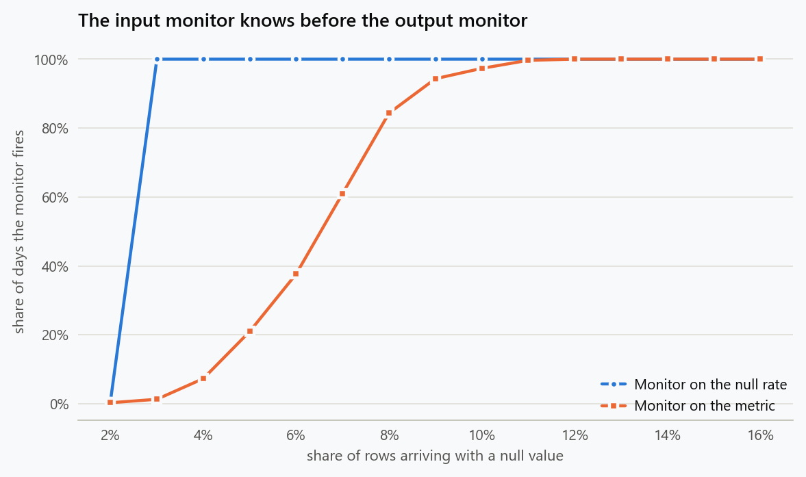
Both monitors use three-sigma limits on their own history, so the comparison is fair. The input monitor catches every one of these on the first day. The output monitor is blind below five percent, coin-flip at eight, and only reliable once the damage is large enough that somebody has already noticed.
There is a second advantage that the table does not show. When the null monitor fires, the diagnosis is already done: the message says which field, which segment and which day. When the metric monitor fires, the investigation starts from scratch, and the first three hypotheses are usually about customers.
The Failure That Leaves the Headline Intact
Nulls at least move something. A renamed category is worse, because the top-line metric is untouched and every breakdown beneath it is wrong.
1
2
3
4
5
6
7
8
9
for lost in (0.0, 0.25, 0.5, 1.0):
    r = np.random.default_rng(17)
    v, s, n = day(rng=r)
    unknown = (s == 2) & (r.random(v.size) < lost)      # premium rows, unrecognised label
    known = ~n & ~unknown
    shares = [np.mean(s[known] == k) for k in range(3)]
    print(f"{lost:4.0%} of premium rows mislabelled: overall metric {v[~n].mean():6.3f}, "
          f"segment shares {shares[0]:5.1%} {shares[1]:5.1%} {shares[2]:5.1%}, "
          f"rows dropped from the breakdown {unknown.mean():5.2%}")
| Premium rows mislabelled | Overall metric | Basic share | Standard share | Premium share | Rows outside the breakdown |
|---|---|---|---|---|---|
| 0% | 16.344 | 56.0% | 29.4% | 14.5% | 0.00% |
| 25% | 16.344 | 58.1% | 30.5% | 11.4% | 3.62% |
| 50% | 16.344 | 60.3% | 31.7% | 8.0% | 7.32% |
| 100% | 16.344 | 65.5% | 34.5% | 0.0% | 14.89% |
The overall metric is identical to three decimal places in every row, because the values did not change and the average is taken over the same rows. What collapses is the composition. By the last row the premium segment has disappeared from the dashboard and the other two look like they have grown.
1
2
3
4
5
6
7
8
9
10
11
12
r = np.random.default_rng(23)
v, s, n = day(rng=r)
unknown = (s == 2) & (r.random(v.size) < 0.5)
known = ~n & ~unknown
for k, name in enumerate(("basic", "standard", "premium")):
    full = v[(s == k) & ~n]
    shown = v[(s == k) & known]
    print(f"{name:9s}: rows {full.size:6,} -> {shown.size:6,} "
          f"({shown.size / full.size - 1:+6.1%}), "
          f"mean {full.mean():6.3f} -> {shown.mean():6.3f}")
print(f"total revenue implied by the breakdown falls "
      f"{np.sum(v[known]) / np.sum(v[~n]) - 1:+.1%} while the average per row holds")
| Segment | Rows before | Rows shown | Change | Mean before | Mean shown |
|---|---|---|---|---|---|
| Basic | 10,888 | 10,888 | +0.0% | 12.005 | 12.005 |
| Standard | 5,917 | 5,917 | +0.0% | 17.891 | 17.891 |
| Premium | 2,807 | 1,422 | −49.3% | 29.966 | 29.860 |
The revenue implied by adding up the breakdown falls 13 percent, while every average in it is unchanged and the company's actual revenue has not moved at all. A team reading segment tables will conclude that premium demand halved. The per-row averages look healthy, which makes the story more convincing rather than less.
What Actually Protects a Metric
The pattern behind all of these is that output monitoring tests a hypothesis about the world using an instrument that also responds to changes in the instrument. Input monitoring separates them.
The checks worth running are unglamorous and cheap. Row counts by source and by segment, compared against the same weekday last week. Null rates per field. The share of rows whose category value is one the pipeline recognises. Join hit rates, since a join that silently drops non-matching rows is the same failure with a different name. Each of these has a tight distribution in quiet periods, which is precisely what makes them sensitive.
The rule of thumb from the table above is that an input check detects a failure at roughly the point where it becomes visible at all, while an output check needs the failure to be several times larger than the metric's natural day-to-day movement.
What to Do
- Monitor inputs, not only outputs. Row counts, null rates, unrecognised category values and join hit rates all have far tighter distributions than the metric they feed.
- Publish the null rate next to any average computed by dropping nulls. Without it, the reader cannot tell a change in the world from a change in coverage.
- Choose the null convention deliberately and write it into the metric definition. Dropping and zero-filling disagree by a factor of five here, and both are defensible.
- Alarm on rows that fall outside the known categories. A renamed value leaves the top-line untouched and quietly empties a segment.
- Reconcile breakdowns against the total. When the parts stop summing to the whole, something upstream has changed, and that check costs one query.
- Put the input check first in the incident runbook for any metric move. It is the cheapest hypothesis to eliminate and the most often correct.
The figure generator in the blog-reproducibility repository reproduces this article's figure; run it with --dry-run to print the numbers behind the figure without writing an image.
References
- Schelter, S., Lange, D., Schmidt, P., Celikel, M., Biessmann, F., & Grafberger, A. (2018). Automating large-scale data quality verification. Proceedings of the VLDB Endowment, 11(12), 1781-1794.
- Breck, E., Polyzotis, N., Roy, S., Whang, S. E., & Zinkevich, M. (2019). Data validation for machine learning. Proceedings of Machine Learning and Systems, 1, 334-347.
- Polyzotis, N., Roy, S., Whang, S. E., & Zinkevich, M. (2017). Data management challenges in production machine learning. Proceedings of the 2017 ACM International Conference on Management of Data, 1723-1726.
- Sculley, D., Holt, G., Golovin, D., Davydov, E., Phillips, T., Ebner, D., Chaudhary, V., Young, M., Crespo, J.-F., & Dennison, D. (2015). Hidden technical debt in machine learning systems. Advances in Neural Information Processing Systems, 28, 2503-2511.
- Little, R. J. A., & Rubin, D. B. (2019). Statistical Analysis with Missing Data (3rd ed.). Wiley.
- Redman, T. C. (1998). The impact of poor data quality on the typical enterprise. Communications of the ACM, 41(2), 79-82.
Embed interactive plots, widgets, and demos using <figure>, <iframe>, or <div class="interactive-embed"> containers. Ensure each embed includes descriptive captions for accessibility.
How to cite
Use the quick export buttons to save citations for reference managers or copy the formatted text directly.
Diogo Ribeiro (2026). Silent Failures: When the Pipeline Changes and the Metric Moves. Faculty of Media Arts and Design, Technical University of Porto. https://diogoribeiro7.github.io/statistics/silent_data_quality_failures/.