Topics
The analysis went to the leadership meeting as a single chart: one dot per store, loyalty sign-up rate on one axis, average basket size on the other, and a correlation of 0.77 across a thousand stores. The recommendation was to push sign-ups, because customers who sign up spend more.
The customer-level correlation in the same data is minus 0.13. Customers who sign up spend slightly less than customers who do not. Both numbers are computed correctly from the same rows. The store chart is a fact about stores, and it was read as a fact about customers.
Two Levels in One Population
Any variable measured on people inside groups splits into two parts: what the group contributes and what the person contributes. Stores differ in catchment, staffing and range, and customers differ within a store. Two variables can then be related at each level separately, and the two relationships need not agree.
The simulation builds exactly that. Each variable has a group part and a person part, with the correlation between the group parts and the correlation between the person parts set independently. The share of a variable that is group is its intraclass correlation.
1
2
3
4
5
6
7
8
9
10
11
12
13
14
15
16
17
18
19
20
21
22
23
24
25
26
27
28
29
30
31
32
33
34
35
36
37
38
39
40
41
42
43
44
45
46
import numpy as np

RNG = np.random.default_rng(19)
GROUPS = 1000


def population(groups, m, icc_x, icc_y, rho_between, rho_within, rng=RNG):
    """Each variable is a group part plus a person part. `rho_between` is the
    correlation between the group parts, `rho_within` the correlation between
    the person parts, and the ICCs say how much of each variable is group."""
    gb = rng.multivariate_normal([0, 0], [[1, rho_between], [rho_between, 1]], groups)
    wi = rng.multivariate_normal([0, 0], [[1, rho_within], [rho_within, 1]], (groups, m))
    x = np.sqrt(icc_x) * gb[:, None, 0] + np.sqrt(1 - icc_x) * wi[:, :, 0]
    y = np.sqrt(icc_y) * gb[:, None, 1] + np.sqrt(1 - icc_y) * wi[:, :, 1]
    return x, y


def individual_corr(x, y):
    return np.corrcoef(x.ravel(), y.ravel())[0, 1]


def group_corr(x, y):
    return np.corrcoef(x.mean(axis=1), y.mean(axis=1))[0, 1]


def predicted_individual(icc_x, icc_y, rho_b, rho_w):
    """Individual correlation implied by the two components."""
    return (rho_b * np.sqrt(icc_x * icc_y)
            + rho_w * np.sqrt((1 - icc_x) * (1 - icc_y)))


def predicted_group(icc_x, icc_y, rho_b, rho_w, m):
    """Correlation of group means: the group parts stay, the person parts average away."""
    cov = rho_b * np.sqrt(icc_x * icc_y) + rho_w * np.sqrt((1 - icc_x) * (1 - icc_y)) / m
    vx = icc_x + (1 - icc_x) / m
    vy = icc_y + (1 - icc_y) / m
    return cov / np.sqrt(vx * vy)


ICC = 0.10
for m in (5, 20, 100, 1000):
    x, y = population(GROUPS, m, ICC, ICC, 0.90, 0.00, rng=np.random.default_rng(2))
    print(f"group size {m:5d}: individuals {individual_corr(x, y):+.3f} "
          f"(predicted {predicted_individual(ICC, ICC, 0.90, 0.00):+.3f})   "
          f"group means {group_corr(x, y):+.3f} "
          f"(predicted {predicted_group(ICC, ICC, 0.90, 0.00, m):+.3f})")
Here the group parts correlate at 0.90, the person parts not at all, and a tenth of each variable is group.
| Group size | Individual correlation | Predicted | Correlation of group means | Predicted |
|---|---|---|---|---|
| 5 | +0.095 | +0.090 | +0.338 | +0.321 |
| 20 | +0.099 | +0.090 | +0.637 | +0.621 |
| 100 | +0.091 | +0.090 | +0.823 | +0.826 |
| 1,000 | +0.093 | +0.090 | +0.898 | +0.892 |
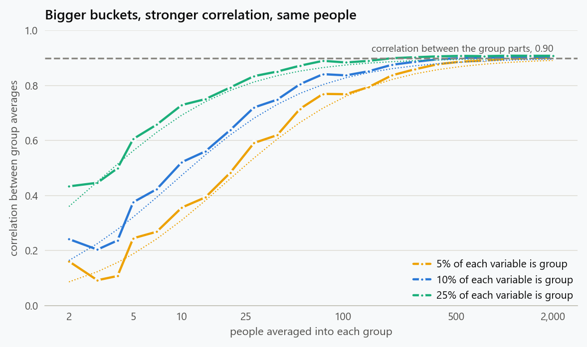
The individual correlation is 0.09 regardless of how the data is grouped, because grouping does not change people. The correlation of group means climbs from 0.34 to 0.90 as groups get larger, approaching the correlation between the group parts. Nothing about the population changed between the rows; only the size of the buckets did.
The closed form behind the last column is worth carrying around. Averaging $m$ people leaves the group component intact and divides the person component by $m$, so
with $\lambda$ the intraclass correlation of each variable. As $m$ grows the expression tends to $\rho_B$, the correlation between the group parts, whatever the individuals are doing. Aggregation does not strengthen a relationship; it discards the level at which the weaker relationship lives.
When the Two Levels Disagree
Inflation is the mild case. The serious one is a sign change, which needs nothing exotic: group parts that move together while people inside a group move oppositely.
1
2
3
4
5
6
7
for rho_b, rho_w, label in ((0.80, -0.30, "groups agree, people disagree"),
                            (-0.60, 0.40, "groups disagree, people agree"),
                            (0.00, 0.50, "no group signal at all"),
                            (0.70, 0.70, "same relationship at both levels")):
    x, y = population(GROUPS, 200, 0.15, 0.15, rho_b, rho_w, rng=np.random.default_rng(4))
    print(f"{label:32s} individuals {individual_corr(x, y):+.3f}   "
          f"group means {group_corr(x, y):+.3f}")
| Population | Individual correlation | Correlation of group means |
|---|---|---|
| Groups agree, people disagree | −0.130 | +0.773 |
| Groups disagree, people agree | +0.246 | −0.591 |
| No group signal at all | +0.423 | +0.013 |
| Same relationship at both levels | +0.700 | +0.708 |
The first row is the store chart from the introduction. The second is its mirror. The third is the one that gets a project cancelled: a real, strong individual relationship that vanishes entirely when the data is reported by group, because there is nothing for the group averages to line up on. Only the last row, where the two levels genuinely agree, lets an aggregate stand in for an individual claim.
Slopes, Which Is What Decisions Use
Correlations are for charts; decisions are made on slopes, because a slope says how much the outcome moves per unit of the thing being changed. Aggregation distorts slopes as well, and in a way that depends on how much of each variable is group.
1
2
3
4
5
6
for icc in (0.05, 0.10, 0.25, 0.50):
    x, y = population(GROUPS, 200, icc, icc, 0.80, -0.20, rng=np.random.default_rng(6))
    b_ind = np.polyfit(x.ravel(), y.ravel(), 1)[0]
    b_grp = np.polyfit(x.mean(axis=1), y.mean(axis=1), 1)[0]
    print(f"group share {icc:4.0%}: individual slope {b_ind:+.3f}   "
          f"group-mean slope {b_grp:+.3f}   ratio {b_grp / b_ind:+6.1f}x")
| Share of each variable that is group | Individual slope | Group-mean slope | Ratio |
|---|---|---|---|
| 5% | −0.147 | +0.697 | −4.7x |
| 10% | −0.098 | +0.740 | −7.5x |
| 25% | +0.048 | +0.769 | +16.1x |
| 50% | +0.292 | +0.780 | +2.7x |
The group-mean slope barely moves across the table, sitting near 0.7 throughout, because it is estimating the between-group relationship and that was fixed at 0.80. The individual slope swings from negative to positive. A forecast built on the aggregate slope, applied to an individual customer, is wrong by a factor of several and sometimes in the wrong direction.
It Looks More Certain Than the Truth
The practical danger is not only that the aggregate differs. It is that the aggregate looks better measured, because averaging removes the noise that makes individual data look messy.
1
2
3
4
5
6
7
8
9
x, y = population(GROUPS, 200, 0.15, 0.15, 0.80, -0.30, rng=np.random.default_rng(8))
r_g = group_corr(x, y)
r_i = individual_corr(x, y)
z = np.arctanh(r_g)
se = 1 / np.sqrt(GROUPS - 3)
lo, hi = np.tanh(z - 1.96 * se), np.tanh(z + 1.96 * se)
print(f"group-level correlation {r_g:+.3f}, 95% interval {lo:+.3f} to {hi:+.3f} on {GROUPS} groups")
print(f"individual correlation {r_i:+.3f} on {x.size:,} people, "
      f"which lies {'inside' if lo <= r_i <= hi else 'outside'} that interval")
| Quantity | Value |
|---|---|
| Correlation of group means | +0.767 |
| Its 95% interval, on 1,000 groups | +0.740 to +0.791 |
| Individual correlation, on 200,000 people | −0.133 |
| Is the individual value inside that interval | No |
The interval is about two and a half percentage points wide either side and it excludes the individual answer by nearly a full unit of correlation. The interval is not wrong: it is a correct interval for the correlation between store averages. It simply has nothing to say about customers, and its narrowness invites the reader to think otherwise.
Reporting Both Levels
The fix is not to avoid aggregates. It is to stop asking one number to carry both meanings. Split the predictor into the group average and the person's deviation from it, and fit both terms at once.
1
2
3
4
5
6
7
8
9
10
11
12
for rho_b, rho_w in ((0.80, -0.30), (0.00, 0.50)):
    x, y = population(GROUPS, 200, 0.15, 0.15, rho_b, rho_w, rng=np.random.default_rng(10))
    gx = x.mean(axis=1, keepdims=True)
    # Centre each person on their group, then fit both terms at once.
    within = (x - gx).ravel()
    between = np.repeat(gx, x.shape[1]).ravel()
    design = np.column_stack([np.ones(x.size), within, between])
    beta, *_ = np.linalg.lstsq(design, y.ravel(), rcond=None)
    naive = np.polyfit(x.ravel(), y.ravel(), 1)[0]
    print(f"between {rho_b:+.2f}, within {rho_w:+.2f}: "
          f"single slope {naive:+.3f}   within-group slope {beta[1]:+.3f}   "
          f"between-group slope {beta[2]:+.3f}")
| Population | Single slope | Within-group slope | Between-group slope |
|---|---|---|---|
| Between +0.80, within −0.30 | −0.135 | −0.299 | +0.770 |
| Between 0.00, within +0.50 | +0.424 | +0.499 | +0.002 |
Both rows recover what was put in. The within-group slope answers the customer question: among customers of the same store, what happens when one signs up. The between-group slope answers the store question: stores with higher sign-up rates have larger baskets, which may be about neighbourhoods rather than about loyalty. The single slope in the first column is a weighted blend of the two, which is why it answers neither.
This decomposition costs one line of preparation and it is the difference between a defensible recommendation and a plausible one. When the two slopes differ substantially, that difference is itself the finding: something about the group, not about the person, is driving the aggregate pattern.
What to Do
- Ask which level the question lives at before choosing the table. A claim about customers needs customer rows, even if the dashboard only offers store rows.
- Measure the intraclass correlation of both variables. It sets how far apart the two levels can be, and it takes one line to compute.
- Compare the overlap of the two answers directly: fit the individual model and the aggregate model and put the slopes side by side. A large gap is a finding, not a nuisance.
- Split the predictor into a group mean and a deviation from it, and report both slopes. Neither one alone is the answer.
- Distrust the tight interval on an aggregate. Its width reflects the number of groups, not the number of people, and it says nothing about whether the aggregate answers your question.
- When only aggregate data exists, say what the estimate is about. "Stores with more sign-ups take larger baskets" is defensible; "customers who sign up spend more" is not the same sentence.
The figure generator in the blog-reproducibility repository reproduces this article's figure; run it with --dry-run to print the numbers behind the figure without writing an image.
References
- Robinson, W. S. (1950). Ecological correlations and the behavior of individuals. American Sociological Review, 15(3), 351-357.
- Selvin, H. C. (1958). Durkheim's Suicide and problems of empirical research. American Journal of Sociology, 63(6), 607-619.
- Greenland, S., & Morgenstern, H. (1989). Ecological bias, confounding, and effect modification. International Journal of Epidemiology, 18(1), 269-274.
- King, G. (1997). A Solution to the Ecological Inference Problem. Princeton University Press.
- Snijders, T. A. B., & Bosker, R. J. (2012). Multilevel Analysis: An Introduction to Basic and Advanced Multilevel Modeling (2nd ed.). Sage.
- Gelman, A., & Hill, J. (2007). Data Analysis Using Regression and Multilevel/Hierarchical Models. Cambridge University Press.
Embed interactive plots, widgets, and demos using <figure>, <iframe>, or <div class="interactive-embed"> containers. Ensure each embed includes descriptive captions for accessibility.
How to cite
Use the quick export buttons to save citations for reference managers or copy the formatted text directly.
Diogo Ribeiro (2025). Group Averages: What Store-Level Data Cannot Tell You About Customers. Faculty of Media Arts and Design, Technical University of Porto. https://diogoribeiro7.github.io/statistics/group_averages_ecological_fallacy/.