A Step-by-Step Guide to Understanding and Calculating the P Value in Statistical Analysis
In statistics, the P Value is a fundamental concept that plays a crucial role in hypothesis testing. It quantifies the probability of observing a test statistic at least as extreme as the one observed, assuming the null hypothesis is true. Essentially, the P Value helps us assess whether the observed differences in data are due to random chance or if they indicate a statistically significant effect.
Grasping the concept of the P Value and how it is calculated is vital for interpreting the results of statistical tests accurately. Misunderstanding this can lead to incorrect conclusions, potentially impacting scientific research, business decisions, and more. For instance, a low P Value might suggest that the observed data is unlikely under the null hypothesis, thereby prompting a rejection of the null hypothesis. Conversely, a high P Value indicates that the observed data is consistent with the null hypothesis.
The importance of the P Value extends beyond mere statistical significance. It provides a standardized way to evaluate results, making it easier to compare findings across different studies and disciplines. By understanding how to calculate the P Value, you can better assess the reliability of your results and make more informed decisions based on statistical evidence.
This article aims to demystify the process of calculating the P Value. We’ll start by explaining what a probability distribution is and why it’s essential in this context. Then, we’ll walk through the steps to go from raw data to determining the P Value, illustrating each step with clear examples. By the end of this article, you should have a solid understanding of how to calculate and interpret P Values, enhancing your ability to analyze data effectively.
What is a Probability Distribution?
A probability distribution is a mathematical function that provides the probabilities of occurrence of different possible outcomes in an experiment. It describes how the probabilities are distributed over the values of the random variable. Essentially, a probability distribution tells us how likely it is to observe various possible outcomes of a random variable.
Definition of a Probability Distribution
Formally, a probability distribution assigns a probability to each possible outcome of a random variable. For a discrete random variable, the probability distribution is described by a probability mass function (PMF). For a continuous random variable, it is described by a probability density function (PDF).
A probability distribution must satisfy the following conditions:
- The probability of each outcome is between 0 and 1.
- The sum of the probabilities of all possible outcomes is equal to 1 for a discrete random variable, and the integral over the entire range of the variable is equal to 1 for a continuous random variable.
Example to Illustrate
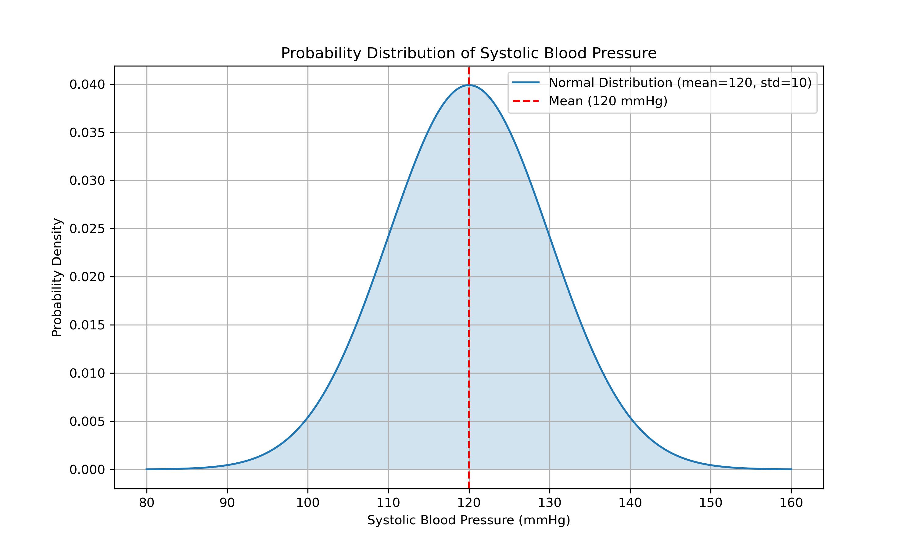
Consider the example of measuring systolic blood pressure in a healthy population. Systolic blood pressure values can vary, and we can represent these values on the X-axis of a graph. The Y-axis would represent the probability or frequency of each value.
In a healthy population, systolic blood pressure values around 120 mmHg are more common, so the graph would peak around this value. Values that are much lower or much higher, such as 80 mmHg or 180 mmHg, are less common and would appear as lower points on the graph.
Visual Representation of Probability Distribution
To visualize this, imagine a graph where the X-axis represents systolic blood pressure values, and the Y-axis represents the probability or frequency of these values. The graph would typically show a bell-shaped curve, known as a normal distribution, with most values clustered around the mean (120 mmHg in this case) and tapering off towards the extremes.
Here’s a description of what this graph might look like:
- The highest point of the curve would be around 120 mmHg, indicating the most common blood pressure value.
- As you move away from 120 mmHg in either direction, the curve gradually decreases, showing that extreme values (both low and high) are less likely.
- The curve is symmetrical around the mean, illustrating that deviations below and above the mean are equally probable in a normal distribution.
- The area under the curve represents the total probability, which is equal to 1.
This visual representation helps us understand the concept of probability distributions better, as it shows how likely different outcomes are, given a certain set of data. Understanding and correctly identifying the appropriate probability distribution is crucial for accurately calculating statistical measures, including the P Value.
Assumptions in P Value Calculation
When calculating the P Value, it is crucial to make certain assumptions about the probability distribution of the population from which the data is drawn. These assumptions form the foundation for determining how likely it is to observe the data under the null hypothesis. Let’s delve into the importance of these assumptions and why the normal distribution is commonly used.
Importance of Assuming a Probability Distribution
Assuming a probability distribution allows statisticians to model the behavior of data and make inferences about the population. This is vital for several reasons:
- Standardization: By assuming a specific distribution, we can use established statistical methods and tables to calculate probabilities.
- Comparison: It enables the comparison of results across different studies and experiments, providing a common framework.
- Inference: Assumptions about the distribution allow us to make inferences about the population parameters based on sample data. Without these assumptions, it would be challenging to quantify the uncertainty and make reliable decisions based on statistical tests.
Common Assumption: Normal Distribution Due to the Central Limit Theorem
One of the most common assumptions in P Value calculation is that the data follows a normal distribution. This assumption is often justified by the Central Limit Theorem (CLT), which states that the sampling distribution of the sample mean approaches a normal distribution as the sample size becomes large, regardless of the shape of the population distribution.
Why the Normal Distribution?
Central Limit Theorem: According to the CLT, the distribution of the sample mean will be approximately normal if the sample size is sufficiently large. This holds true even if the underlying population distribution is not normal. Convenience: The normal distribution is mathematically tractable and well understood. Many statistical methods and tables are based on the normal distribution, making calculations easier and more standardized. Wide Applicability: The normal distribution often provides a good approximation for the distribution of many natural phenomena and measurements, such as heights, test scores, and measurement errors. By assuming a normal distribution, we can use Z-scores and standard normal distribution tables to determine the P Value. For small sample sizes, other distributions, such as the t-distribution, might be more appropriate, but the underlying principle remains the same: we assume a specific distribution to facilitate the calculation of probabilities.
Visual Representation
In practice, the assumed normal distribution allows us to visualize and understand the distribution of sample data. The bell-shaped curve of the normal distribution illustrates how data points are expected to spread around the mean, with most values clustering near the center and fewer values appearing as we move further from the mean.
Here is an example code snippet to visualize a normal distribution, as previously discussed:
import numpy as np
import matplotlib.pyplot as plt
from scipy.stats import norm

# Parameters for the normal distribution
mean = 120  # Mean of the distribution
std_dev = 10  # Standard deviation of the distribution

# Generate a range of systolic blood pressure values
x = np.linspace(mean - 4*std_dev, mean + 4*std_dev, 1000)

# Calculate the probability density function (PDF) for the normal distribution
pdf = norm.pdf(x, mean, std_dev)

# Create the plot
plt.figure(figsize=(10, 6))
plt.plot(x, pdf, label='Normal Distribution (mean=120, std=10)')
plt.fill_between(x, pdf, alpha=0.2)
plt.title('Probability Distribution of Systolic Blood Pressure')
plt.xlabel('Systolic Blood Pressure (mmHg)')
plt.ylabel('Probability Density')
plt.axvline(mean, color='red', linestyle='--', label='Mean (120 mmHg)')
plt.legend()
plt.grid(True)

# Save the plot to a file
plt.savefig('systolic_blood_pressure_distribution.png', dpi=300)

# Show the plot
plt.show()
By understanding and correctly applying these assumptions, we can calculate the P Value more accurately, leading to more reliable and meaningful statistical inferences. The next section will guide you through the step-by-step process of calculating the P Value, from defining the null hypothesis to interpreting the results.
Steps to Calculate the P Value
Calculating the P Value involves several systematic steps, each building on the previous one. Here’s a detailed guide:
Determine the Test Statistic
The first step in calculating the P Value is to determine the test statistic, which is a standardized value that measures the degree of difference between your observed data and what is expected under the null hypothesis. The test statistic depends on the type of statistical test you are performing. Common test statistics include:
- Sample Mean (for t-tests): Used when comparing the means of two groups.
- Proportion (for proportion tests): Used when comparing sample proportions to a known proportion or between groups.
- Chi-Square Statistic (for chi-square tests): Used in tests of independence and goodness-of-fit tests.
For example, if you are comparing the average systolic blood pressure of a sample to a known population mean of 120 mmHg, the test statistic could be the sample mean.
Locate the Test Statistic on the Distribution
Once you have your test statistic, the next step is to locate it on the assumed probability distribution. This involves determining where your observed value falls within the context of the distribution under the null hypothesis.
For a normal distribution, you would place your test statistic on the standard normal curve. For example, if your test statistic is the sample mean, you would compare it to the population mean under the normal distribution.
Measure the Distance
To quantify how far your test statistic is from the assumed mean, calculate the number of standard deviations (or standard errors) away from the mean it lies. This is often referred to as the Z-score (in the case of a normal distribution) or the t-score (for a t-distribution).
The formula for the Z-score is: \(Z = \frac{X - \mu}{\sigma}\)
Where:
- \(X\) is the test statistic (e.g., sample mean).
- \(\mu\) is the population mean.
- \(\sigma\) is the population standard deviation.
If using the t-distribution (common with smaller sample sizes), the formula for the t-score is: \(t = \frac{X - \mu}{\frac{s}{\sqrt{n}}}\)
Where:
- \(X\) is the sample mean.
- \(\mu\) is the population mean.
- \(s\) is the sample standard deviation.
- \(n\) is the sample size.
Find the Probability
Finally, determine the probability of observing a value as extreme or more extreme than your test statistic under the null hypothesis. This involves finding the area under the curve of the probability distribution beyond the observed test statistic.
For a normal distribution, this probability can be found using Z-tables or statistical software that provides the cumulative distribution function (CDF). For a t-distribution, t-tables or software can be used.
The P Value is the sum of the probabilities in the tails of the distribution beyond your test statistic. If your test statistic falls in the extreme tails (far from the mean), the P Value will be low, indicating that such an extreme value is unlikely under the null hypothesis.
Example Code to Calculate and Visualize the P Value
Here’s a Python example to illustrate these steps using a normal distribution:
import numpy as np
import matplotlib.pyplot as plt
from scipy.stats import norm

# Parameters for the normal distribution
mean = 120  # Population mean
std_dev = 10  # Population standard deviation
sample_mean = 130  # Sample mean
sample_size = 30  # Sample size
std_error = std_dev / np.sqrt(sample_size)  # Standard error of the mean

# Calculate the Z-score
z_score = (sample_mean - mean) / std_error

# Calculate the P Value
p_value = 2 * (1 - norm.cdf(np.abs(z_score)))  # Two-tailed test

# Generate a range of values for plotting
x = np.linspace(mean - 4*std_dev, mean + 4*std_dev, 1000)
pdf = norm.pdf(x, mean, std_dev)

# Create the plot
plt.figure(figsize=(10, 6))
plt.plot(x, pdf, label='Normal Distribution (mean=120, std=10)')
plt.fill_between(x, pdf, alpha=0.2)

# Highlight the area beyond the Z-score
x_fill_left = np.linspace(mean - 4*std_dev, mean - np.abs(z_score)*std_error, 1000)
x_fill_right = np.linspace(mean + np.abs(z_score)*std_error, mean + 4*std_dev, 1000)
plt.fill_between(x_fill_left, norm.pdf(x_fill_left, mean, std_dev), color='red', alpha=0.3)
plt.fill_between(x_fill_right, norm.pdf(x_fill_right, mean, std_dev), color='red', alpha=0.3)

# Add lines and labels
plt.axvline(mean, color='blue', linestyle='--', label='Mean (120 mmHg)')
plt.axvline(sample_mean, color='green', linestyle='--', label='Sample Mean (130 mmHg)')
plt.title('Probability Distribution of Systolic Blood Pressure')
plt.xlabel('Systolic Blood Pressure (mmHg)')
plt.ylabel('Probability Density')
plt.legend()
plt.grid(True)

# Save the plot to a file
plt.savefig('systolic_blood_pressure_distribution_p_value.png', dpi=300)

# Show the plot
plt.show()

# Print the Z-score and P Value
print(f'Z-score: {z_score}')
print(f'P Value: {p_value}')
Explanation
Z-score Calculation: This calculates how many standard deviations the sample mean is from the population mean. P Value Calculation: This uses the cumulative distribution function (CDF) to find the probability of observing a value as extreme as the test statistic. Plotting: This creates a visual representation of the normal distribution, highlighting the areas that correspond to the P Value.
By following these steps, you can accurately calculate and interpret the P Value for your data, providing insight into the statistical significance of your results. Understanding the nuances of the P Value calculation process is essential for making informed decisions based on data analysis.
Example with t-Distribution
When dealing with small sample sizes or when the population standard deviation is unknown, the t-distribution is often used instead of the normal distribution for P Value calculations. The t-distribution is similar to the normal distribution but has heavier tails, which accounts for the additional uncertainty introduced by estimating the population standard deviation from the sample.
Explanation of Using t-Distribution for P Value Calculation
The t-distribution is used in place of the normal distribution when the sample size is small (typically less than 30) or when the population standard deviation is unknown. It is particularly useful in t-tests, where we compare sample means to a known population mean or between two sample means.
The key difference between the t-distribution and the normal distribution is that the t-distribution takes into account the degrees of freedom (df), which is related to the sample size. As the sample size increases, the t-distribution approaches the normal distribution.
How to Use a t-Distribution Table
1. Finding Degrees of Freedom Degrees of freedom (df) in the context of a t-distribution is typically calculated as the sample size minus one. For example, if you have a sample size of 30, the degrees of freedom would be:
\[\text{df} = n - 1\]Where \(n\) is the sample size. For our example:
\[\text{df} = 30 - 1 = 29\]2. Determining the Number of Standard Deviations (t-score) To find the t-score, which measures how many standard errors the sample mean is away from the population mean, use the following formula:
\[t = \frac{X - \mu}{\frac{s}{\sqrt{n}}}\]Where:
- \(X\) is the sample mean.
- \(\mu\) is the population mean.
- \(s\) is the sample standard deviation.
- \(n\) is the sample size.
For example, if the sample mean is 130 mmHg, the population mean is 120 mmHg, the sample standard deviation is 12 mmHg, and the sample size is 30, the t-score is calculated as:
\[t = \frac{130 - 120}{\frac{12}{\sqrt{30}}}\]3. Looking Up the Probability (P Value) Once you have the t-score and degrees of freedom, you can use a t-distribution table or statistical software to find the P Value. The table provides critical values for different levels of significance. For a two-tailed test, you would look up the absolute value of your t-score and find the corresponding probability.
For instance, if your t-score is 4.00 with 29 degrees of freedom, you would locate the row corresponding to 29 degrees of freedom in the t-distribution table and find the critical value that is closest to 4.00. The table will give you the area in the tails beyond this t-score, which is the P Value.
Example Code to Calculate and Visualize the P Value using t-Distribution
Here’s a Python example to illustrate these steps using a t-distribution:
import numpy as np
import matplotlib.pyplot as plt
from scipy.stats import t

# Parameters for the t-distribution
sample_mean = 130  # Sample mean
population_mean = 120  # Population mean
sample_std = 12  # Sample standard deviation
sample_size = 30  # Sample size
degrees_of_freedom = sample_size - 1  # Degrees of freedom

# Calculate the t-score
t_score = (sample_mean - population_mean) / (sample_std / np.sqrt(sample_size))

# Calculate the P Value
p_value = 2 * (1 - t.cdf(np.abs(t_score), df=degrees_of_freedom))  # Two-tailed test

# Generate a range of values for plotting
x = np.linspace(-4, 4, 1000)
pdf = t.pdf(x, df=degrees_of_freedom)

# Create the plot
plt.figure(figsize=(10, 6))
plt.plot(x, pdf, label=f't-Distribution (df={degrees_of_freedom})')
plt.fill_between(x, pdf, alpha=0.2)

# Highlight the area beyond the t-score
x_fill_left = np.linspace(-4, -np.abs(t_score), 1000)
x_fill_right = np.linspace(np.abs(t_score), 4, 1000)
plt.fill_between(x_fill_left, t.pdf(x_fill_left, df=degrees_of_freedom), color='red', alpha=0.3)
plt.fill_between(x_fill_right, t.pdf(x_fill_right, df=degrees_of_freedom), color='red', alpha=0.3)

# Add lines and labels
plt.axvline(0, color='blue', linestyle='--', label='Mean Difference (0)')
plt.axvline(t_score, color='green', linestyle='--', label=f'Sample t-Score ({t_score:.2f})')
plt.axvline(-t_score, color='green', linestyle='--')
plt.title('t-Distribution with Sample t-Score')
plt.xlabel('t Value')
plt.ylabel('Probability Density')
plt.legend()
plt.grid(True)

# Save the plot to a file
plt.savefig('t_distribution_p_value.png', dpi=300)

# Show the plot
plt.show()

# Print the t-score and P Value
print(f't-score: {t_score}')
print(f'P Value: {p_value}')
Summary
Understanding P Values is crucial for interpreting the results of statistical tests accurately. The P Value provides a measure of the strength of evidence against the null hypothesis, helping researchers and analysts determine whether observed differences or relationships in the data are statistically significant or likely due to random chance.
By accurately calculating and interpreting P Values, you can make informed decisions based on your data, whether in scientific research, business analytics, or any field that relies on statistical inference. Knowing how to compute the P Value, understanding the assumptions behind its calculation, and being able to visualize the results contribute to a more robust and reliable analysis.
Mastering the concept of P Values enhances your ability to critically evaluate the significance of your findings, compare results across different studies, and communicate your conclusions effectively. This foundational knowledge is essential for anyone involved in data analysis, providing a clear framework for making evidence-based decisions.