The Normal Distribution
In the bustling tapestry of life, patterns and chaos dance together in an intricate ballet. We humans, driven by an innate curiosity, seek to understand this dance, to find meaning in the seemingly random, to discern the hidden rhythms of nature. This quest has led us to the doorstep of probability and statistics, a realm where numbers and theories intertwine to reveal the secrets of the universe.
Imagine standing on a beach, watching the waves crash against the shore. Each wave is unique, yet there’s a pattern, a rhythm that connects them all. This is the essence of probability distributions. They are the mathematical waves that describe how things are spread out, how they cluster, how they behave in the wild dance of randomness.
From the heights of people in a bustling city to the twinkling stars in the night sky, from the unpredictable stock market to the gentle fall of cherry blossoms, probability distributions are everywhere. They are the hidden threads that weave the fabric of our world.
But why should we care about these abstract mathematical concepts? Because they are the keys to unlocking the mysteries of our world. They help doctors predict the spread of diseases, enable meteorologists to forecast the weather, guide investors in the stock market, and even assist in predicting the outcome of your favorite sports game.
In this article, we will embark on an exciting journey into the world of probability distributions. We’ll explore the classic bell curve, delve into the magic of averages, uncover the 80–20 rule, and much more. Along the way, we’ll discover how these mathematical tools are not just dry, academic concepts but vibrant, living ideas that resonate with our daily lives.
So grab your explorer’s hat and join me on this adventure. Whether you’re a seasoned mathematician or a curious novice, there’s something here for everyone. Let’s dive into the fascinating world of probability distributions and uncover the beauty and complexity of the dance between order and chaos.
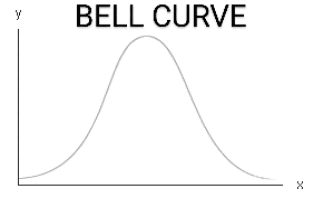
The Normal Distribution — The Classic Bell Curve
The Normal Distribution! It’s not just a curve; it’s a symphony of statistical elegance, a mathematical marvel that resonates with the rhythm of nature and human life. Let’s embark on an exploration of this fascinating distribution.
Introduction to the Normal Distribution
The Normal Distribution, often referred to as the Gaussian Distribution, is a continuous probability distribution characterized by its bell-shaped curve. It’s everywhere! From the heights of people to the marks on a test, the Normal Distribution is a universal phenomenon.
The mathematical expression for the Normal Distribution is:
\[f(x | \mu, \sigma^2) = \frac{1}{\sqrt{2\pi\sigma^2}} e^{-\frac{(x - \mu)^2}{2\sigma^2}}\]Here, μ is the mean, and σ is the standard deviation. These two parameters define the entire curve!
Real-world examples
Imagine measuring the heights of all adults in a city. You’ll find that the heights are distributed around an average value, with fewer people being extremely tall or short. This distribution of heights would closely resemble the Normal Distribution.
Similarly, in a classroom, test scores often follow the Normal Distribution. Most students score around the average, with fewer scoring significantly higher or lower.
A simple explanation of mean and standard deviation
The mean, μ, is the average value, the center of the distribution. It’s where the peak of the bell curve is located.
The standard deviation, σ, tells us how spread out the values are. A small standard deviation means the values are tightly clustered around the mean, while a large standard deviation indicates a wider spread.
Together, μ and σ shape the curve, encapsulating the essence of the data.
Fun fact: Why it’s called the “bell curve”
The term “bell curve” comes from the shape of the graph. It starts low, rises to a peak at the mean, and then symmetrically falls, forming a curve that resembles a bell. It’s a visual melody, a mathematical harmony that has captivated statisticians and mathematicians for centuries.
The Normal Distribution is more than a mathematical concept; it’s a testament to the underlying order in a world filled with randomness. It’s a bridge between theory and reality, a tool that unlocks the secrets of nature.
The Central Limit Theorem — Magic in Averages
The Central Limit Theorem (CLT) it’s not just a theorem; it’s a magical insight into the world of statistics. It’s like a mathematical spell that turns chaos into order, complexity into simplicity. Let’s dive into this captivating concept.
Central Limit Theorem in Simple Terms
The Central Limit Theorem is a statistical superstar. It tells us that if you take a large enough sample of independent, identically distributed random variables, their sum (or average) will be approximately normally distributed, regardless of the original distribution of the variables.
Here’s the mathematical beauty of it:
\[\bar{X} \approx N\left(\mu, \frac{\sigma^2}{n}\right)\]where \(\bar{X}\) is the sample mean, \(\mu\) is the population mean, \(\sigma^2\) is the population variance, and \(n\) is the sample size.
Flipping Coins or Rolling Dice
Imagine flipping a coin many times. Each flip is like a random variable, and the outcome can be heads or tails. Now, if you take the average of a large number of flips, the distribution of that average will form a beautiful bell curve, a Normal Distribution!
Or think about rolling a six-sided die. Each roll is random, but if you roll it many times and take the average, the Central Limit Theorem ensures that those averages will follow the Normal Distribution.
It’s like a symphony where each instrument plays its own tune, but together they create a harmonious melody. That’s the magic of the Central Limit Theorem!
import numpy as np
import matplotlib.pyplot as plt
from scipy.stats import norm

def plot_normal_distribution(mean, std_dev, filename, size=1000):
    """
    Plots a Normal Distribution with a given mean and standard deviation.

    Parameters:
        mean (float): The mean of the normal distribution.
        std_dev (float): The standard deviation of the normal distribution.
        filename (str): The name of the file where the plot will be saved.
        size (int): The number of random samples to generate.

    Returns:
        None

    Examples:
        >>> plot_normal_distribution(0, 1, "normal_distribution.png")
        >>> plot_normal_distribution(5, 2, "normal_distribution_5_2.png")
    """

    # Generate data points for the normal distribution
    data = np.random.normal(mean, std_dev, size)

    # Generate x-axis values for the PDF
    x = np.linspace(min(data), max(data), 100)

    # Compute PDF values
    pdf_values = norm.pdf(x, mean, std_dev)

    # Plot the histogram of the generated data
    plt.hist(data, bins=30, density=True, alpha=0.6, color='g', label='Histogram')

    # Plot the PDF of the normal distribution
    plt.plot(x, pdf_values, linewidth=2, color='r', label='PDF')

    plt.title(f'Normal Distribution\n Mean={mean}, Std Dev={std_dev}')
    plt.xlabel('Value')
    plt.ylabel('Frequency')
    plt.legend()

    # Save the plot as a PNG file
    plt.savefig(filename)

    plt.show()

# Test the function
if __name__ == "__main__":
    plot_normal_distribution(0, 1, "normal_distribution.png")
Central Limit Theorem in Everyday Statistics
The Central Limit Theorem is the backbone of many statistical methods and analyses. It’s why we can use the Normal Distribution to make inferences about the population from a sample.
It’s the reason why, in a world filled with diverse and complex distributions, we can still find common ground in the Normal Distribution. It’s a unifying principle that allows us to apply statistical techniques widely and confidently.
From quality control in manufacturing to understanding voter behavior in elections, the Central Limit Theorem plays a vital role. It’s not just a mathematical curiosity; it’s a practical tool that shapes our understanding of the world.
The Central Limit Theorem is like a mathematical wizard that turns the randomness of life into a pattern we can understand. It’s a bridge between the abstract and the concrete, a key that unlocks the door to statistical wisdom.
The following Python code will simulate the Central Limit Theorem in action. It’s going to create multiple samples from a uniform distribution (which is distinctly not normal), average them, and then show that the distribution of those averages is, indeed, a Normal Distribution.
import numpy as np
import matplotlib.pyplot as plt

def central_limit_theorem_demo(sample_size: int, num_samples: int, num_bins: int, filename: str) -> None:
    """
    Demonstrates the Central Limit Theorem by averaging samples from a uniform distribution.

    Parameters:
        sample_size (int): The size of each sample.
        num_samples (int): The number of samples to average.
        num_bins (int): The number of bins for the histogram.
        filename (str): The name of the file where the plot will be saved.

    Returns:
        None

    Examples:
        >>> central_limit_theorem_demo(30, 1000, 50, "central_limit_demo.png")
    """

    # Generate a large number of samples from a uniform distribution between 0 and 1
    samples = np.random.uniform(0, 1, (num_samples, sample_size))

    # Compute the means of these samples
    sample_means = np.mean(samples, axis=1)

    # Plotting the histogram of the sample means
    plt.hist(sample_means, bins=num_bins, density=True, color='b', alpha=0.7, label='Sample Means')

    plt.title('Central Limit Theorem in Action')
    plt.xlabel('Sample Mean')
    plt.ylabel('Frequency')
    plt.legend()

    # Save the plot as a PNG file
    plt.savefig(filename)

    plt.show()

# Test the function
if __name__ == "__main__":
    central_limit_theorem_demo(30, 1000, 50, "central_limit_demo.png")
Power Law Distribution — The 80–20 Rule
If the Normal Distribution is the harmonious symphony of averages, then the Power Law is the riveting solo performance that steals the spotlight. It’s a mathematical revelation that gets to the heart of imbalance, impact, and influence. Hold onto your seats as we delve into the world of the 80–20 rule and its spectacular manifestations in economics, social media, and even the natural world.
Introducing the 80–20 Rule: The Pareto Principle
Often known as the Pareto Principle, the 80–20 rule is a compelling embodiment of the Power Law Distribution. It’s a simple yet profound idea: 80% of the outcomes come from 20% of the causes. This disproportionality is not just a casual observation but a mathematical inevitability under the umbrella of Power Law Distributions.
The mathematical representation of the Power Law can be expressed as:
\[P(x) = a \cdot x^{-k}\]Here, \(P(x)\) is the probability of an event \(x\) occurring, while \(a\) and \(k\) are constants. Notice the inverse relationship? It’s this essence that drives the inherent inequalities we often see.
Real-World Examples: Economics, Social Media, and Nature
Economics: In any given economy, it’s often observed that 20% of the population controls about 80% of the wealth. It’s not an equal distribution; it’s a Power Law. The top earners make a disproportionately high amount, and this imbalance shapes economic policies, investment strategies, and even social justice initiatives.
Social Media: Ever noticed how a small percentage of posts or users get the majority of likes, shares, or views? That’s the 80–20 rule at play again. A minuscule amount of content gets a disproportionate amount of attention, which has significant implications for digital marketing, public opinion, and even democracy.
Nature: Even Mother Nature isn’t immune to the allure of the Power Law. Think about earthquakes. Most are too small to feel, but a tiny percentage are cataclysmic. The distribution of earthquake magnitudes fits snugly into a Power Law model, offering us essential insights into risk assessment and disaster preparedness.
The Intrigue of Outliers
In a Normal Distribution, outliers are statistical anomalies, rarities. But in a Power Law Distribution, outliers are the main event! They are the events that carry the most weight and impact. Think of the ‘viral’ posts on social media or the ‘blockbuster’ products in a market. These outliers often defy average-based analyses and necessitate a different approach for accurate prediction and understanding.
In a Power Law, the “tail” of the distribution is long, meaning outliers can have extremely high values. These outliers are not just “noise”; they are critical data points that can provide insights into the mechanism underlying the distribution.
The Power Law Distribution, encapsulated by the 80–20 rule, is an eye-opening look into the fundamental asymmetries of our world. It’s an ode to the impactful, the significant, and the influential. It forces us to think differently about averages, to appreciate the imbalances, and to consider the extraordinary power of the few.
In the enchanting dance between order and chaos, the Power Law reminds us that imbalance is not an anomaly but a cornerstone of the universe. It gives us the mathematical language to understand the power of the few over the many, adding yet another mesmerizing tune to the statistical symphony that shapes our world.
Let’s Visualize the Power Law Distribution!
import numpy as np
import matplotlib.pyplot as plt

def plot_power_law(a: float, k: float, x_min: float, x_max: float, num_points: int, filename: str) -> None:
    """
    Plots the Power Law Distribution P(x) = ax^{-k}.

    Parameters:
        a (float): Constant a in the equation P(x) = ax^{-k}.
        k (float): Exponent k in the equation P(x) = ax^{-k}.
        x_min (float): Minimum value of x for the plot.
        x_max (float): Maximum value of x for the plot.
        num_points (int): Number of points to plot.
        filename (str): The name of the file where the plot will be saved.

    Returns:
        None

    Example:
        >>> plot_power_law(1, 2.5, 1, 100, 1000, "power_law_plot.png")
    """

    # Generate x-values
    x_values = np.linspace(x_min, x_max, num_points)

    # Calculate y-values based on the Power Law equation
    y_values = a * (x_values ** -k)

    # Plotting
    plt.plot(x_values, y_values, label=f'a={a}, k={k}')
    plt.xlabel('x')
    plt.ylabel('P(x)')
    plt.title('Power Law Distribution')
    plt.legend()

    # Save the plot
    plt.savefig(filename)

    plt.show()

# Test the function
if __name__ == "__main__":
    plot_power_law(1, 2.5, 1, 100, 1000, "power_law_plot.png")
Log-Normal Distribution — Growth and Multiplication
The Normal Distribution represents the elegant balance of nature and the Power Law exposes the inherent imbalances, then the Log-Normal Distribution is the melodious hymn of growth and multiplication. This is where the multiplicative nature of processes comes to life in a statistical crescendo. So, let’s unravel the math behind stock prices, growth phenomena, and why “compound interest is the eighth wonder of the world.”
Introducing the Log-Normal Distribution
The Log-Normal Distribution is akin to the Normal Distribution, but with a twist! It describes a process whose logarithm follows a Normal Distribution. In simpler terms, if Y is log-normally distributed, then ln(Y) is normally distributed.
The mathematical expression for the Log-Normal Distribution is:
\[f(x) = \frac{1}{x \sigma \sqrt{2\pi}} \exp\left( -\frac{(\ln(x) - \mu)^2}{2\sigma^2} \right)\]Here, \(\mu\) and \(\sigma\) are the mean and standard deviation of the variable’s natural logarithm, respectively.
Stock Prices and More: Real-world Examples
Stock Prices: The prices of stocks are often modeled using a Log-Normal Distribution because stock prices can’t go below zero and often exhibit exponential growth over long periods. The volatile ups and downs, the seemingly random walks of stock prices, can all be understood better through the lens of the Log-Normal Distribution.
The Symphony of Growth and Multiplication
Growth Phenomena: Think about a bacterial colony or even human population growth. These aren’t additive; they’re multiplicative processes. The Log-Normal Distribution provides a framework for understanding such phenomena. The distribution allows for exponential growth, capturing the essence of these systems beautifully.
Compound Interest: Ah, the magic of compounding! This is another area where the Log-Normal Distribution shines. The power of exponential growth encapsulated in the compound interest formula is an experiential journey into the log-normal world.
A Simple Illustration
To visualize the Log-Normal Distribution, you could plot it using a software like Python’s Matplotlib or even Excel. The x-axis will represent your variable, such as stock prices, while the y-axis will represent the frequency. Unlike the symmetrical bell curve of the Normal Distribution, you’ll notice that the Log-Normal Distribution is positively skewed, capturing the potential for exponential growth on one end.
import numpy as np
import matplotlib.pyplot as plt
from scipy.stats import lognorm

def plot_log_normal_distribution(mean, std_dev, filename, size=1000):
    """
    Plots a Log-Normal Distribution using given mean and standard deviation.

    Parameters:
        mean (float): The mean of the log-normal distribution.
        std_dev (float): The standard deviation of the log-normal distribution.
        size (int): The number of random samples to generate.

    Returns:
        None

    Examples:
        >>> plot_log_normal_distribution(0, 0.4)
        >>> plot_log_normal_distribution(0.5, 0.2)
    """

    # Generate data points for the log-normal distribution
    data = np.random.lognormal(mean, std_dev, size)

    # Generate x-axis values for the PDF
    x = np.linspace(min(data), max(data), 100)

    # Compute PDF values
    pdf_values = lognorm.pdf(x, std_dev, scale=np.exp(mean))

    # Plot the histogram of the generated data
    plt.hist(data, bins=30, density=True, alpha=0.6, color='b', label='Histogram')

    # Plot the PDF of the log-normal distribution
    plt.plot(x, pdf_values, linewidth=2, color='r', label='PDF')

    plt.title(f'Log-Normal Distribution\n Mean={mean}, Std Dev={std_dev}')
    plt.xlabel('Value')
    plt.ylabel('Frequency')
    plt.legend()
    # Save the plot as a PNG file
    plt.savefig(filename)
    plt.show()


# Test the function
if __name__ == "__main__":
    plot_log_normal_distribution(0, 0.4, "log_normal.png")
So there we are, sailing through yet another fascinating probability distribution! The Log-Normal Distribution provides us with the mathematical vernacular to express multiplicative phenomena and growth. It’s a phenomenal tool, adding another layer of sophistication to our understanding of the world around us.
Isn’t the world of probability distributions just enthralling? Each distribution is a unique dance move in the waltz of statistics and life. Stay tuned, the mathematical odyssey is far from over!
A Universe of Shapes and Functions
Poisson Distribution — The Rare Events Emissary
The Poisson Distribution is commonly used to model the number of times an event occurs within a fixed interval of time or space. It is particularly useful for describing rare events that happen independently of one another.
Mathematical Expression:
\[P(k; \lambda) = \frac{\lambda^k e^{-\lambda}}{k!}\]Here, \(P(k; \lambda)\) is the probability of observing \(k\) events, where \(\lambda\) is the average event rate, and \(k!\) is the factorial of \(k\).
Real-World Example:
Consider the number of customer arrivals at a store in an hour, or the number of decay events in a radioactive sample over a certain period. These types of rare events are well-modeled by the Poisson Distribution.
Exponential Distribution — The Waiting Game
The Exponential Distribution models the time between occurrences of successive events in a Poisson process, making it ideal for waiting-time problems.
Mathematical Expression:
\[f(x; \lambda) = \lambda e^{-\lambda x}\]Here, \(\lambda\) is the rate parameter, which represents the average number of events occurring per unit of time.
Real-World Example:
The time before a bus arrives at a station or the lifespan of electronic components are scenarios that follow the Exponential Distribution.
Gamma Distribution — The Generalist
The Gamma Distribution is a versatile two-parameter family of continuous probability distributions that generalizes several other distributions, including the Exponential and Chi-squared distributions.
Mathematical Expression:
\[f(x; \alpha, \beta) = \frac{\beta^\alpha x^{\alpha - 1} e^{-\beta x}}{\Gamma(\alpha)}\]Where \(\alpha\) and \(\beta\) are shape and rate parameters, and \(\Gamma(\alpha)\) is the Gamma function.
Real-World Example:
The Gamma Distribution is useful in hydrology for modeling rainfall data, as well as in telecommunications for modeling packet traffic.
The Symphony of Distributions
Each distribution plays a unique role, much like instruments in an orchestra. The Poisson Distribution captures rare events, the Exponential Distribution models waiting times, and the Gamma and Beta Distributions provide versatility for a wide range of applications. Together, they help us understand the diverse and complex nature of real-world phenomena.
We’ve only scratched the surface of the world of distributions. Just as you wouldn